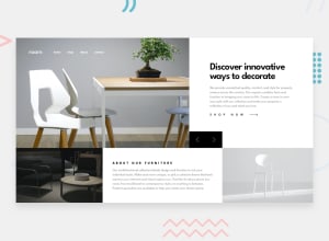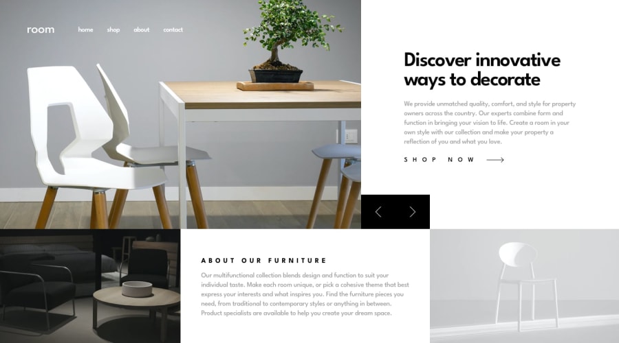
Design comparison
Solution retrospective
The difficulties I faced while building this project:
- Angle arrows' positioning, I was unable to position them the same way they are in the original design.
- Making the design fit full-screen on all devices. My workaround was to give a max-width of 1440 because that's the most optimal for the photos provided.
Community feedback
- @JeuriMorelPosted about 1 year ago
Hey Ahmed, you might want to check the preview site link as it leads to the live site of a different solution.
I don't know if this is what you were going for, but you're not allowing the user to click on the left/right arrow icons. This is the code that's causing that behavior:
object, path {
    pointer-events: auto!important;
}
The content on the page is overflowing the root
div. When you scroll down the root's gray background stops and give's way to the body's white background. To fix this simply remove theheight: 100vh;from the#root0@ElHuzainPosted about 1 year ago@JeuriMorel Hey Jeuri, yeah. I mixed up between two challenge as both had similar names. I have redeployed the project and it now displays the correct solution. Thanks!
1
Please log in to post a comment
Log in with GitHubJoin our Discord community
Join thousands of Frontend Mentor community members taking the challenges, sharing resources, helping each other, and chatting about all things front-end!
Join our Discord
