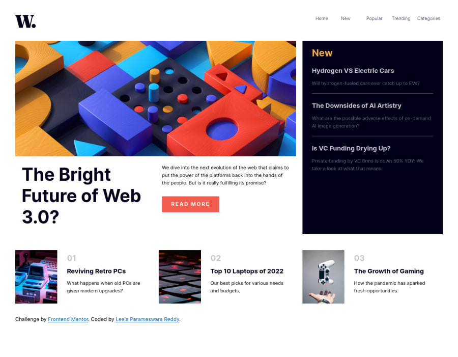
Responsive landing page using css grid, flex and sass
Design comparison
Solution retrospective
-
When writing Saas, I felt difficult when using media queries, usually media queries being written inside class in SaaS, but my confusion was whether i should write media queries for children inside parent?
-
I try to do some experiment with transitions, instead of simply using burger icon and javascript, i tried to use css trick for menu which is working but the rotation of the burger lines was not happening where they convert into cross, but i implemented this another website. so figuring out.
-
I have questions related to performance, Do i have to use less classes for better performance? Do i use grid or flex which one is faster? Is position:absolute slower, do we have alternatives? I used position fixed to display menu items, is there any better way?
Community feedback
- @AdrianoEscarabotePosted over 2 years ago
Hello Leela, how are you? I truly loved your project's outcome, however I have some advice that I hope you'll find useful:
I noticed that you used a
buttonin which case the best option would be ana, because in my head when a person clicks on a button written Read more, he is not confirming a form, or something like, it will be redirected to another page, to read more about!to solve this problem do this:
<a href="/" class="button">Read more</a>Consider using rem for font size .If your web content font sizes are set in absolute units, such as pixels, the user will not be able to re-size the text or control the font size based on their needs. Relative units “stretch” according to the screen size and/or user’s preferred font size, and work on a large range of devices.
if you want to continue coding with px, you can download a very useful extension in vscode, it converts px to rem! link -> px to rem
The remainder is excellent.
I hope it's useful. 👍
0@vlpreddyPosted over 2 years ago@AdrianoEscarabote
I totally missed about button it should be link for better accessibility as well, I will fix this issue quickly.
I will try to use rem from now onwards, it makes sense, i did used this unit in live projects but didn't think through all this, I guess i need to read about the units a little bit, thanks for the advice.
1 - @half-ctoPosted over 2 years ago
Hi Leela, great work on completing challenge.
Regarding media queries, I like to set up a mixin like this one
@mixin desktop {
    @media screen and (min-width: $desktop-size) {
        @content;
    }
}
and use it inside element I'm changing, I find it keeps clean structure and is easy to troubleshoot.
0@vlpreddyPosted over 2 years ago@half-cto
I think this is one of smart way of using mixin. Is there any difference between using inside element itself and using inside it's parent element?
0@half-ctoPosted over 2 years ago@vlpreddy I'm using query inside element, I find it keeps file more organized.
0 - @JdanielmendozaPosted over 2 years ago
esta genial..
0
Please log in to post a comment
Log in with GitHubJoin our Discord community
Join thousands of Frontend Mentor community members taking the challenges, sharing resources, helping each other, and chatting about all things front-end!
Join our Discord
