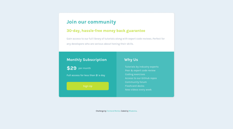
Responsive landing page using CSS Grid and Media queries
Design comparison
Solution retrospective
How could I make it more responsive? Currently, media query is set to 900px, I don't wanna overdo it with queries, how to know when adding a query is necessary and when it's not?
Community feedback
- @denieldenPosted about 3 years ago
Hi Mladenka, good job!
It adds a query when the design breaks. As a rule, as few queries as possible are used, and in desktop, tablet, and mobile resolutions.
Also to center the elements on the page try using Flexbox, it can help you better: give the flexbox and
heightproperties to thebodyand removemarginfrom the#grid-wrapperid.Read the guide -> Flexbox
Note: Flexbox aligns to the size of the parent container.
You can use the
vhmeasurement for the height... Viewport Height handles the sizing of an element in relation to the height of the browser window.Hope this help ;)
0 - @dannyboi07Posted about 3 years ago
Just add another media query that sets the layout in the intermediate duration between the desktop version and mobile version. Good responsive sites that I've seen have three media queries on average. You could use 4. Desktop, laptop, tablet and mobile.
It would be nice if there was another media query that modifies the layout around the time when the Sign up button breaks into two lines.
Also don't modify the body element and include it into the layout. Instead have a master card container, set the widths etc. Then you could flex the body element and set centering css properties.
0
Please log in to post a comment
Log in with GitHubJoin our Discord community
Join thousands of Frontend Mentor community members taking the challenges, sharing resources, helping each other, and chatting about all things front-end!
Join our Discord
