Submitted about 2 years ago
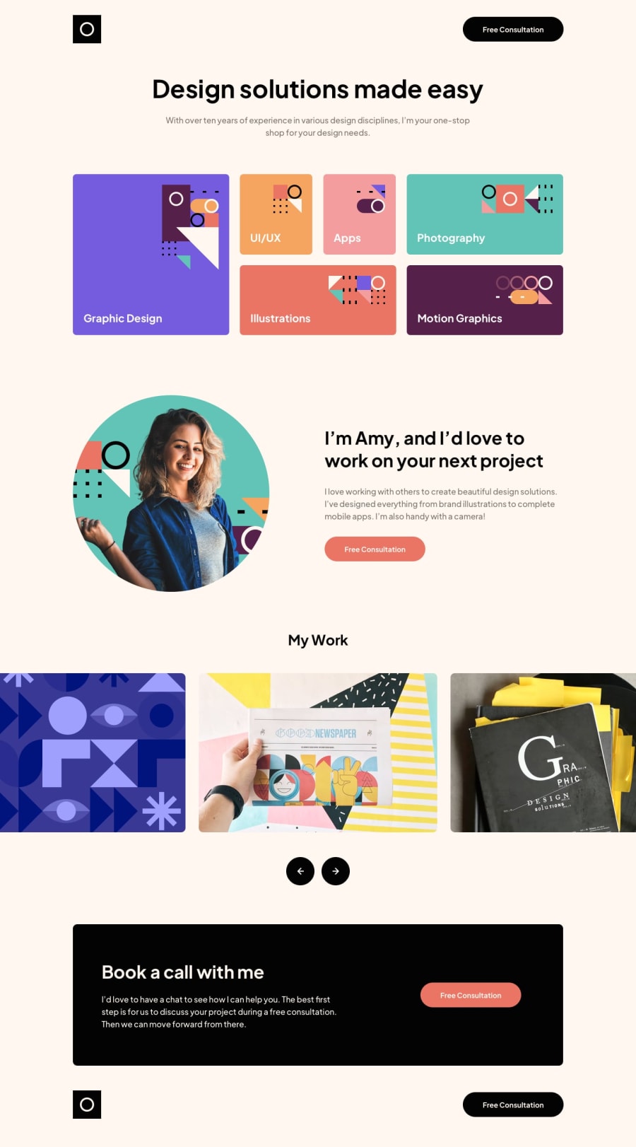
Responsive landing page using CSS Grid and GSAP
@Eric-Ferole
Design comparison
SolutionDesign
Solution retrospective
I struggled with the IPad break point. It's seems that you cannot change your grid template at all once it's set. You have to keep the same for all your breakpoint. Is that right ?
For the iPad break point, I couldn't figure how to make the first element .design take half of the grid and and the .uiux and .app take the other half as there was only 6 columns : 3 for the .design and 3 for both .uiux and app. Can you follow me here ?
I would be glad to know If there's an other way. There should be an other way.
Any other comments would be appreciated.
Community feedback
Please log in to post a comment
Log in with GitHubJoin our Discord community
Join thousands of Frontend Mentor community members taking the challenges, sharing resources, helping each other, and chatting about all things front-end!
Join our Discord
