Submitted 7 months ago
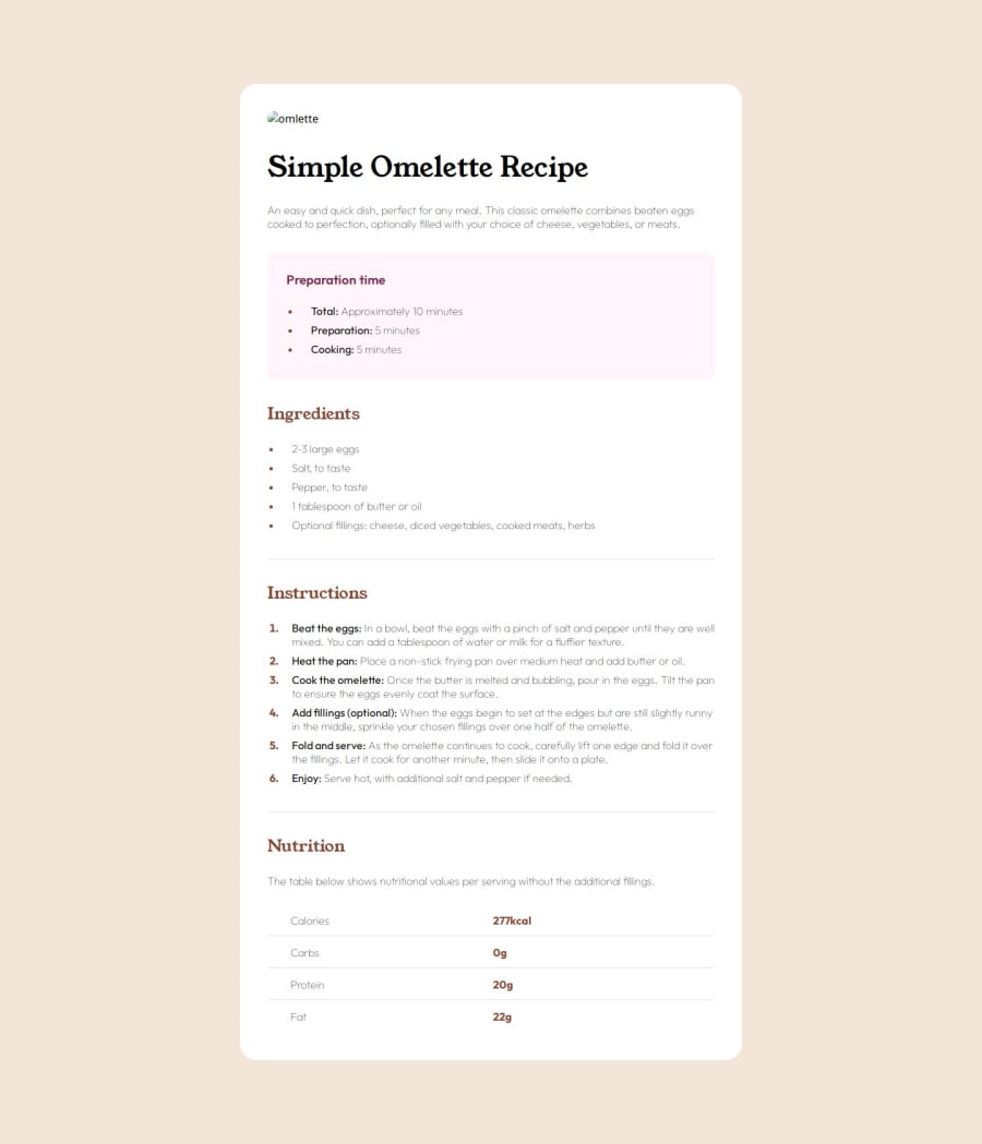
Responsive landing page using CSS grid and flexbox
@mirkozlatunic
Design comparison
SolutionDesign
Solution retrospective
What are you most proud of, and what would you do differently next time?
The element adjustment was achieved through learning the margin and padding of list elements.
The project will be approached section by section. This means that I will style the body first and then move on to smaller elements.
What challenges did you encounter, and how did you overcome them?I faced a major challenge while designing my project's end part. I decided to go with a table instead of a grid element. Although the table solution was faster, I believe the grid approach would have been better for styling.
Community feedback
Please log in to post a comment
Log in with GitHubJoin our Discord community
Join thousands of Frontend Mentor community members taking the challenges, sharing resources, helping each other, and chatting about all things front-end!
Join our Discord
