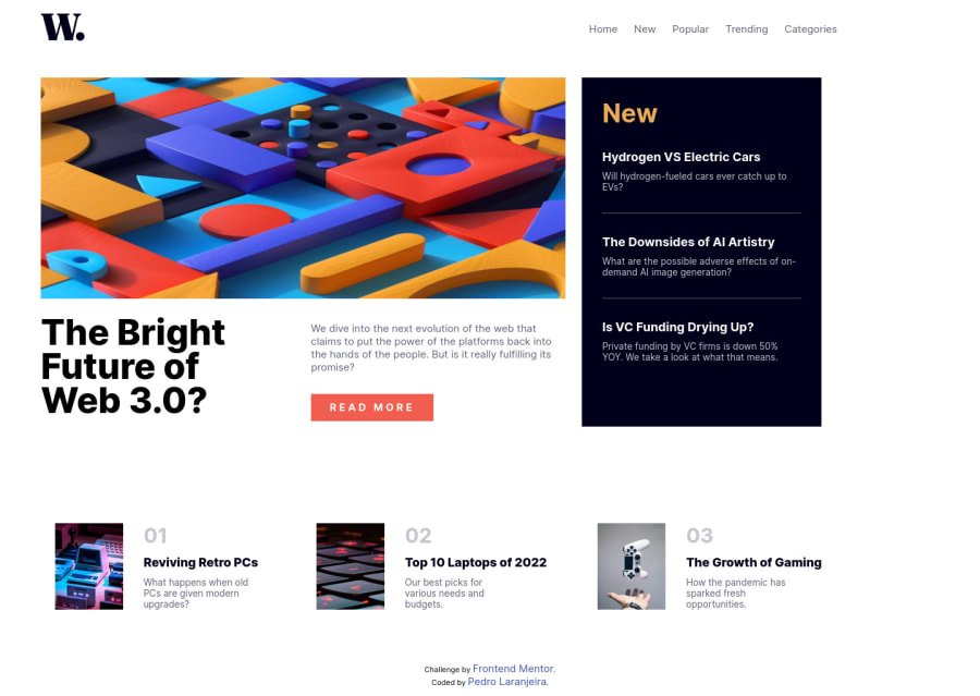
Responsive landing page using CSS Grid and Flexbox
Design comparison
Solution retrospective
Was it possible to do the same project with bootstrap?
The mobile resolution (375px) was for min or max width? I didn't get it and used the resolution of 912px to adapt for most mobile phones.
What was the best option for this project? Display Grid or Flexbox?
Community feedback
- @AdrianoEscarabotePosted about 2 years ago
Hi Pedro Laranjeira, how are you? I really liked the result of your project, but I have some tips that I think you will enjoy:
images must have alt text unless it is a decorative image, for any decorative image each IMG tag must have empty
alt=""and addaria-hidden="true"attributes to make all the assistive technologies of the Web, as screen reader. Learn the differences between decorative/meaningless images vs important content.I noticed that you used a
buttonin which case the best option would be ana, because in my head when a person clicks on a button written Read more, he is not confirming a form, or something like, it will be redirected to another page, to read more about!To resolve do this:
<a href="/" class="grid1-img-btn">READ MORE</a>The rest is great!
I hope it helps... 👍
Marked as helpful0
Please log in to post a comment
Log in with GitHubJoin our Discord community
Join thousands of Frontend Mentor community members taking the challenges, sharing resources, helping each other, and chatting about all things front-end!
Join our Discord
