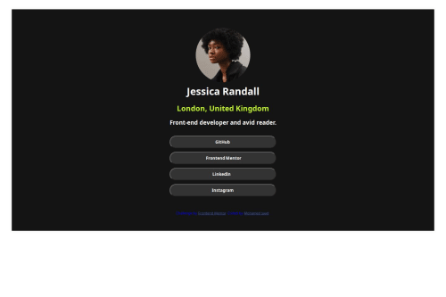
Submitted over 1 year agoA solution to the Social links profile challenge
Responsive landing page using css grid
airtable

@mohamedsaad2006
Solution retrospective
What are you most proud of, and what would you do differently next time?
I have a lot to learn, so I try to repeat and look at other solutions in order to master what I want to learn
What challenges did you encounter, and how did you overcome them?Dealing and downloading fonts from Google still does not work well
What specific areas of your project would you like help with?Dealing with embedding fonts from Google Know my learning level first hand
Code
Loading...
Please log in to post a comment
Log in with GitHubCommunity feedback
No feedback yet. Be the first to give feedback on mohmed saad's solution.
Join our Discord community
Join thousands of Frontend Mentor community members taking the challenges, sharing resources, helping each other, and chatting about all things front-end!
Join our Discord