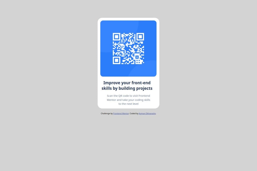
Design comparison
SolutionDesign
Community feedback
- P@devchris03Posted 4 months ago
Hello, your solution is well, but I could like to help you about some things:
- Do not set a fixed width for the body, doing so will make it no longer responsive. The centering of the card looks good only when the screen complies with the fixed width you set.
- To align the card horizontally you can add a maximum width and add a margin-inline: auto. To do it vertically you can also set a maximum height and calculate the width of the screen - the height of the card, divide by 2 the result and assign the margin-block of the new result.
- If the above is complicated for you to understand, you can align with a display:flex. It will be easier to do it this way. I recommend that you can observe a little of it, you will see that it will help you a lot.
- It is that you add a maximum width that a fixed width to the card. This will help to make it easier for the design to adapt to any screen.
I know that with practice you will gain more experience. Keep it up and you will succeed.
0
Please log in to post a comment
Log in with GitHubJoin our Discord community
Join thousands of Frontend Mentor community members taking the challenges, sharing resources, helping each other, and chatting about all things front-end!
Join our Discord
