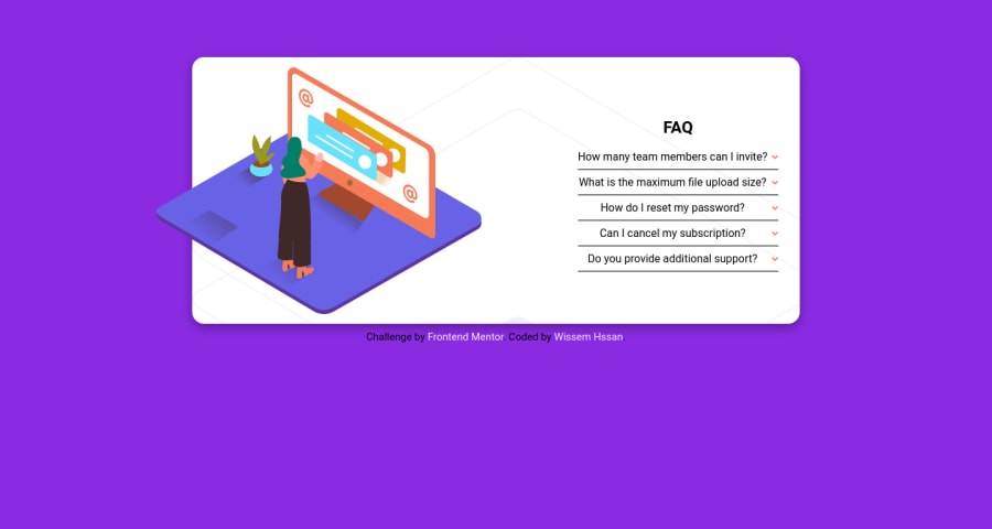
Design comparison
Solution retrospective
This is my first project ever. Even though it is a simple one, it helped me practice some basic concepts I've recently learn theoretically. I'll be very happy to recieve any comments on my Frontend Mentor or Gmail accounts that can help me improve my skills.
Community feedback
- @vanzasetiaPosted almost 3 years ago
Hi Wissem! 👋
Congratulations on finishing your first challenge! 🎉
I get an alert message when I view your website, it says the following:
"Please note that this project only has a desktop and a mobile version. No special design for meduim screens."
I would recommend removing the alert message and also even though the design images only provide the desktop and mobile layout, you should still make the website responsive. In this case, you could make the tablet layout as one column (the same as the mobile layout). 🙂
Some feedback:
- Accessibility
- Good job on using
footer
landmark! 👍 - All the page content should live inside landmark elements (
header
,nav
,main
, andfooter
). By using them correctly, you can make users of assistive technology navigate the website easily. In this case, you can wrap all of it withmain
tag,except the attribution.
- Good job on using
<body> <main> page content goes here... </main> <footer class="attribution"> attribution links goes here... </footer> </body>
- Currently, the accordion panels are not accessible. The easiest way to fix this issue is to use the native HTML accordion, which are
details
andsummary
. - Use CSS
border
property to create the line.hr
element has a role as a separator. In this case, the content below the line should not be separated. - Always wrap text content with a meaningful element. Only use
div
andspan
for styling purposes. You can read this article aboutdiv
, written by Scott O'Hara. It will tell you when to usediv
and how to use it. - Every
img
tag should havealt
attribute. If you think the arrow icons and illustration are decorative, you can leave thealt=""
empty and it is still a valid HTML. - Use
rem
or sometimesem
unit instead ofpx
. Usingpx
will not allow the users to control the size of the page based on their needs. - Styling
- I would recommend using flexbox to align the arrow icon.
- Put a
max-width
on thecontainer
element to prevent it becoming too wide on mobile landscape view (640px * 360px). - To make the card perfectly in the middle of the page, you can make the
body
element as a flexbox container instead of using theplaceholder
element.
/** * 1. Make the card vertically center and * allow the body element to grow if needed */ body { display: flex; align-items: center; justify-content: center; min-height: 100vh; /* 1 */ }
- Functionality
- I would recommend creating a
function
where the user is only allowed to open one accordion panel at a time. By doing that, you can prevent the card from having a lot of height.
- I would recommend creating a
- Best Practice (Recommended)
- Write your code with consistent style (e.g. the indentation, quotes, whitespace, etc). If you write your code with consistent style, it will make it easier to read for everyone (including you, yourself).
- There's no need to put a space before and after the equal sign.
<div class = "question">
That's it! Hopefully, this is helpful! 😁
Marked as helpful0 - Accessibility
Please log in to post a comment
Log in with GitHubJoin our Discord community
Join thousands of Frontend Mentor community members taking the challenges, sharing resources, helping each other, and chatting about all things front-end!
Join our Discord