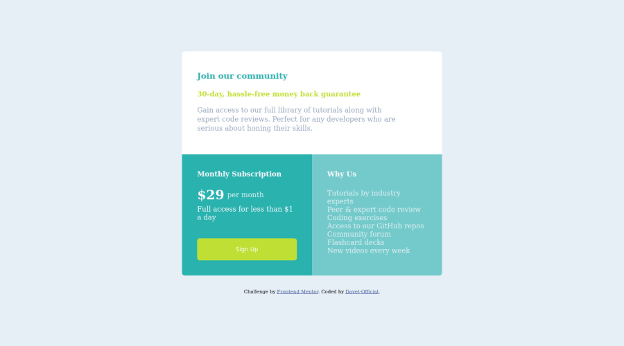
Design comparison
Community feedback
- @VCaramesPosted about 2 years ago
Hey @DavetOluwapelumi, some suggestions to improve you code:
-
There are only three headings in this component; “Join our community”, “Monthly Subscription”, and “Why us”.
-
The incorrect
font-familyis being used. You want to look at the “style-guide” to download the correct one. -
The button was created with the incorrect element. When users click on the button they should directed to a different part of your site; that Anchor Element will allow this to happen.
-
Your button needs to have
box-shadow,cursor: pointerand a:hover. -
In desktop view, the "Monthly Subscription" and "Why Us" are stretching out to the bottom of the screen. This needs fixing.
-
Implement a Mobile First approach 📱 > 🖥
With mobile devices being the predominant way that people view websites/content. It is more crucial than ever to ensure that your website/content looks presentable on all mobile devices. To achieve this, you start building your website/content for smaller screen first and then adjust your content for larger screens.
Happy Coding! 👻🎃
0 -
Please log in to post a comment
Log in with GitHubJoin our Discord community
Join thousands of Frontend Mentor community members taking the challenges, sharing resources, helping each other, and chatting about all things front-end!
Join our Discord
