


Design comparison


Solution retrospective
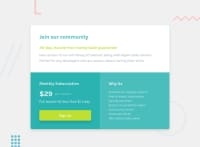
- "Gain access to our full library of tutorials along with expert code reviews. Perfect for any developers who are serious about honing their skills."
Two sentences above are in the same <p>. I don't know how to break these two in separated line (for desktop view) and combine them into a single line (for mobile view)
-
It takes me nearly 200 lines of code to finish the project. How can I write it in more simple way?
-
This is the 3rd projects and I don't know the best way to center the container (whole component). My only solution is to write like this and pray it works. However, using flex on
<body>, I want the component to be bigger (for the width) but I can't because the width of component is fixed at 714px. I set the flex item<container>withmax-width: 1000px;but it won't grow any more than 714px.
body {
  min-height: 100vh;
  display: flex;
  flex-direction: column;
  justify-content: center;
  align-items: center;
}

.container {
  max-width: 1000px;
}
Thank you guys for the feedbacks.
Community feedback
Please log in to post a comment
Log in with GitHub
Join our Discord community
Join thousands of Frontend Mentor community members taking the challenges, sharing resources, helping each other, and chatting about all things front-end!
Join our Discord