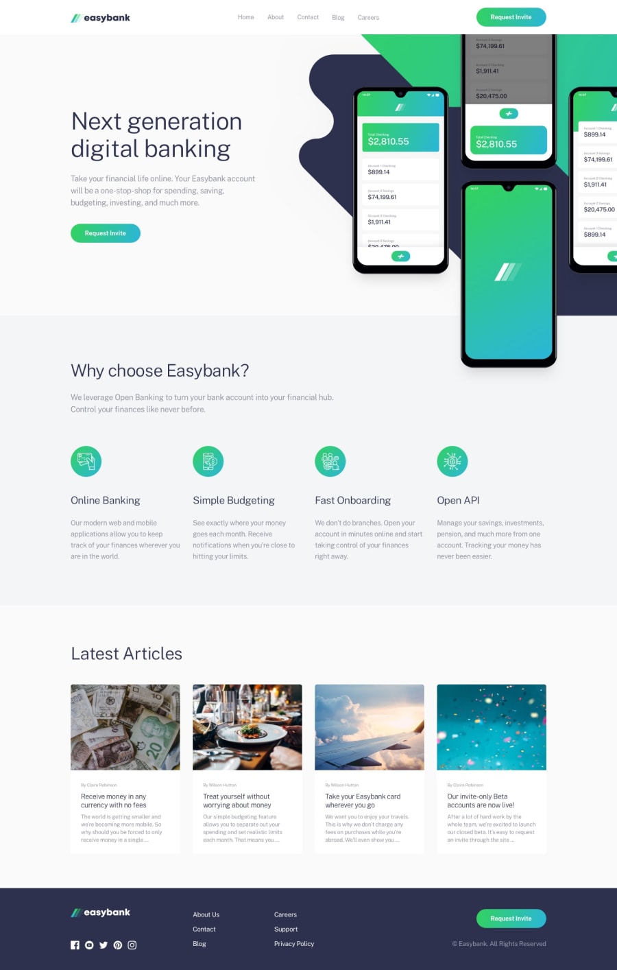
Design comparison
SolutionDesign
Solution retrospective
What are you most proud of, and what would you do differently next time?
I'm proud of how I was able to solve the issue I had with placing the hero image without the page overflowing.
What challenges did you encounter, and how did you overcome them?My major challenge was with the hero image. From the design, on a large screen, the hero image was a bit cut out of the screen. I tried implementing this using the right positioning property but was getting a page overflow. So I figured that just giving the image a negative right margin on a larger screen fixed the issue I was having.
What specific areas of your project would you like help with?I did a little bit of accessibility but will be happy to know if there are areas I can improve on.
Community feedback
Please log in to post a comment
Log in with GitHubJoin our Discord community
Join thousands of Frontend Mentor community members taking the challenges, sharing resources, helping each other, and chatting about all things front-end!
Join our Discord
