


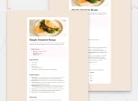


This all looks very very small! And doesn't have the right fonts. I think you need to try and refactor it to look much closer to the original design if you can.
Here is some feedback
- Make sure you understand the difference between padding and margin
- Look up how to write good alt text on images.
- Set the body font size to be the same as what is defined in the style-guide, except converted to rem before using it in code. This tells you what size the default text should be, like the paragraphs throughout this. You won't need to set a font size on the paragraphs I think.
- Link fonts from Google in the HTML head. They will provide the code you need once you've chosen the specific families and weights you want.
- Headings should ideally go in hierarchical order an not skip heading levels. That means "preparation" should be a h2.
- I recommend you give the
thelementsscope="row"so it is programmatically clear that they are headers for the rows and not columns. - This component must not have a width. All it needs is a max-width in rem. Because you've given it an explicit pixel width in the media query it is overflowing my screen.
- The only thing that really needs to change in the media query is the component should be flush with the screen edges on mobile and not in larger screens. Maybe border radius too, and a top/bottom margin on larger screens.
- Ideally, the mobile style should be the default and the desktop change (the extra space around the component) should be added in a min-width media query, where that media query itself is defined in em or rem.
0
@Tifem
Posted
@grace-snow Thank you very much for this feedback
0

