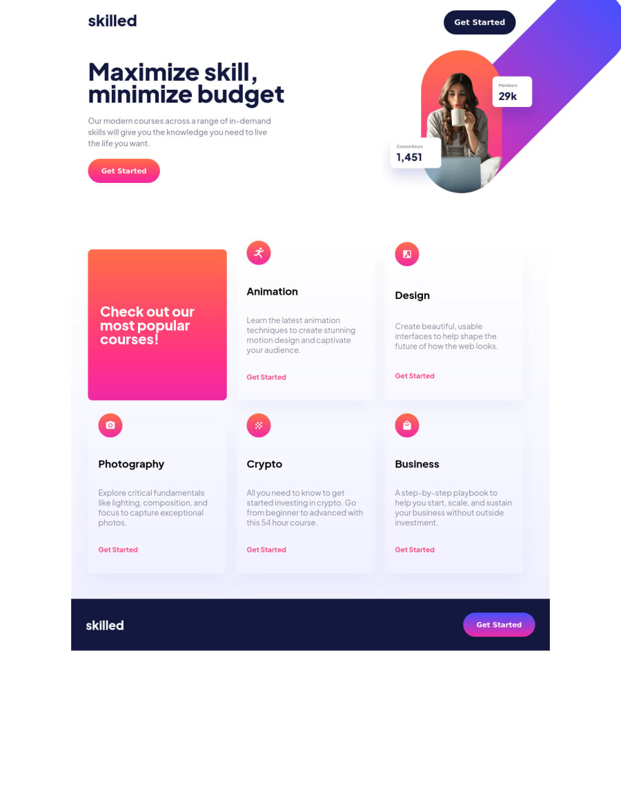


Design comparison

Solution retrospective
This was my first time building a site from a Figma design template. It took me a little bit to figure that out. I would have probably done this differently without this design. I used more fixed sizes because I had that information. I don't feel like I was very efficient with my code, but I will get better.
Community feedback
- @KKS1991Posted almost 3 years ago
Hi Stephen,
I think we've somethin in common, we both are rookies but nevertheless I want to offer you my humble feedback. 😊
First at all - i like your work, good job Stephen. Especially I like the card-effects you've used. In regard to your "Report". There are some accessibility issues. You need to "frame" your code into an "main" section like this.
<main id=“mainpage“> … </main>In my opinion it seems you need to cluster more of your content in sections as well like you did here:
<section id=“lessons-container> … </section>I also had this problem in the past and someone recommended me the solution above. With regard to the HTML Validation it seems your chosen values for the images issues errors. If you take a closer look to the given design you can see, that there are two Breakpoints.
- Mobile
- Tablet (min-width: 740px)
- Desktop (min-width: 1440px)
If you use Figma like me, you need the shortcut „v“ and a right click on the design-layout. The tablet-version has a width of 720px and the desktop-version has a width of 1440px. For the mobile-version there is no need for setting a media, because the image for the mobile-version (image-hero-mobile.png) displays till a width of 720px is reached. I suggest you following solution:
      <source media="(min-width: 1440px)"
              srcset="assets/image-hero-desktop.png" >

      <source media="(min-width: 720px)"
              srcset="assets/image-hero-tablet.png">

      <source srcset="assets/image-hero-mobile.png">

      <img class="hero__img" src="assets/image-hero-mobile.png" alt="A woman with a cup">
With a closer look on your style.css-file i want to suggest you to choose more specific names for your classes. Instead of
.paragraph-1 ...
you should use something like
.title-text ... or .title-description ...
In the Desktop-Version the content isn’t over the whole side and it isn’t centered. Maybe a
margin: 0 auto;
on your „page-container“ will solve the centering issue. If you’re looking for great and free CSS/HTML-Tutorials I can totally recommend you the Youtube-Channel from Kevin Powell (https://www.youtube.com/kepowob).
How I just said – good job and keep coding. 😊
Marked as helpful1P@SlyssyPosted almost 3 years ago@KKS1991 Thank you for the feedback. I agree with you on pretty much everything you said. I typically do wrap my elements in divs, but I was experimenting with individual element placement with grid in the top portion of this project. I probably won't ever do that again.
I'll take a look at the desktop version. I could have sworn I had it centered. Also, thank you for the code snippet in regards to the source media content. That was the first time I ever used it, and I couldn't get the mobile image to load. I didn't realize you didn't have to specify a break point like you did for the mobile view. That'll come in handy.
I'll go back and revise the code, and I will use your suggestions. Also, I suck at picking class names. Thank you again for the feedback. I really do appreciate it.
0P@SlyssyPosted almost 3 years ago@KKS1991 Oh. I watch Kevin Powell all the time. Basically Kevin and Jonas Schmedtman taught me HTML, CSS and JavaScript.
0 - @haribhujuPosted almost 3 years ago
Hi Stephen Great work, I have also completed this project few days back. I think the button on your main nav is not working due to hero image position. I have also similar problem and i fixed using
position: relative z-index: 1
on header nav.
Thanks Hari Sharan Bhuju
1P@SlyssyPosted almost 3 years ago@haribhuju Thanks for pointing that out. I didn't even test that after I resized the image. Great catch.
0


Please log in to post a comment
Log in with GitHub
Join our Discord community
Join thousands of Frontend Mentor community members taking the challenges, sharing resources, helping each other, and chatting about all things front-end!
Join our Discord