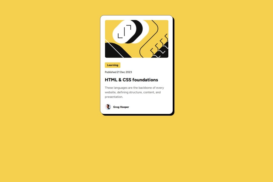
Design comparison
Solution retrospective
Pride in Learning: "I'm most proud of successfully completing my first HTML and CSS challenge. It feels great to start applying the concepts I’ve learned so far, especially since it’s my first hands-on experience with building something from scratch." Problem-Solving: "I’m also proud of how I was able to solve problems that came up during the challenge, like aligning elements or adjusting layout using CSS. It was rewarding to see how everything came together." Attention to Detail: "I’m particularly proud of the attention I paid to the small details in the design, like choosing the right colors and fonts, which made the layout look more polished." Commitment: "I stayed committed to finishing the task despite it being my first time handling a complete HTML and CSS project."
Planning: "Next time, I’d spend more time planning the layout before jumping into the coding part. I realized that having a clear structure in mind could make the process more efficient." Organizing Code: "I would also focus on organizing my CSS better by using classes and IDs more efficiently. This would help improve readability and make future adjustments easier." Using Flexbox/Grid: "While I managed to arrange elements with basic CSS, I would explore more advanced layout techniques like Flexbox or Grid next time to improve the responsiveness and alignment." Better Time Management: "I’d allocate my time more effectively by dividing the challenge into smaller tasks with set goals, so I can focus on each part without feeling overwhelmed."
What challenges did you encounter, and how did you overcome them?Understanding Layouts: "One of the biggest challenges I encountered was figuring out how to properly structure the layout of the webpage. It was tricky at first to get the elements to align the way I wanted." CSS Styling Issues: "I also faced challenges with styling elements using CSS. Sometimes, the styling didn’t apply as I expected, especially when dealing with padding, margins, or centering content." Responsiveness: "Making the design responsive on different screen sizes was another challenge. It was difficult to balance how the elements looked on both desktop and mobile screens." Overwhelming New Concepts: "There were moments when I felt overwhelmed by the sheer number of new concepts, like when to use certain HTML tags or how different CSS properties work together."
Trial and Error: "To overcome the layout issues, I used a trial-and-error approach, tweaking the HTML structure and CSS properties until things started to make sense visually. Each adjustment helped me understand how small changes affect the entire design." CSS Documentation & Tutorials: "I referred to CSS documentation and online tutorials to understand the properties better. When I couldn’t figure out how to make things work, I researched specific problems and found solutions." Flexbox and Grid Exploration: "I started experimenting with Flexbox and Grid after realizing their potential to simplify layout challenges. This helped improve the alignment of elements and made the design more flexible." Break Down the Task: "I broke down the challenge into smaller parts and tackled each part one at a time. This made the process more manageable and less overwhelming." Patience and Persistence: "Most importantly, I stayed patient and kept experimenting until I found solutions that worked. Each challenge became a learning opportunity."
What specific areas of your project would you like help with?Responsive Design: "I’d like help with making my design more responsive, especially for mobile devices. I struggled with making sure the layout adjusts smoothly to different screen sizes without elements overlapping or breaking." CSS Best Practices: "I would also appreciate guidance on CSS best practices, like how to better organize my styles and optimize the use of classes, IDs, and selectors to keep my code clean and efficient." Flexbox and Grid: "Even though I experimented with Flexbox and Grid, I feel like I could use more help understanding when and how to apply them correctly to different layout scenarios." Improving Accessibility: "I’d like to learn more about making my project more accessible, such as incorporating semantic HTML elements and using CSS to enhance readability and usability for all users." Debugging Tools: "Lastly, I could use some tips on how to effectively use browser developer tools for debugging CSS and HTML issues. I often found it challenging to identify the exact cause of problems when elements didn’t behave as expected."
Community feedback
Please log in to post a comment
Log in with GitHubJoin our Discord community
Join thousands of Frontend Mentor community members taking the challenges, sharing resources, helping each other, and chatting about all things front-end!
Join our Discord
