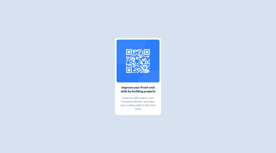
Design comparison
Solution retrospective
I find difficulty in keeping the page from overflowing on mobile. I would love your feedback on how to go about that.
Community feedback
- @correlucasPosted over 2 years ago
👾Hello Lukman, congratulations for your solution!
I saw your live site and is working perfectly is responsive in mobile and desktop. You've don't have any issue with that. What is your doubt?
The only thing you can improve is adding a margin for the container to avoid the card component touching the screen bounds when it scales down for mobile. See the code below:
main {
    margin: 24px;
}
Hope it helps and feel free to ask me more question, happy coding!
Marked as helpful0@HinaSejaru124Posted over 2 years ago@correlucas Hello please follow me up when I submit my work. I am @HinaSejaru124
0@HinaSejaru124Posted over 2 years ago@correlucas Hey Lucas. My pseudo is an abbreviation<hina = Hinata(Naruto Shippuden),Sej = Seijuro Akashi(Kuroko's Basket),aru = Subaru Natsuki(RE:Zero)>.I'm actually a14year old boy you know< and an anime fan(as well as programming)>
0 - @shivaprakash-sudoPosted over 2 years ago
Hello Lukman,
Good job on submitting your first challenge!
I have checked the live site and the card looks fantastic in both mobile and desktop screens, but I couldn't find any overflowing, can you please elaborate on what is overflowing or how to re-create the problem you're facing?
Good luck on your next projects!
Marked as helpful0
Please log in to post a comment
Log in with GitHubJoin our Discord community
Join thousands of Frontend Mentor community members taking the challenges, sharing resources, helping each other, and chatting about all things front-end!
Join our Discord
