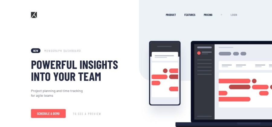
Design comparison
Solution retrospective
If you have any tips or suggestions for improvements I would like to know. Thanks for the comments!
Community feedback
- @mattstuddertPosted almost 5 years ago
You've done really well on this challenge, Lailton! Your solution looks great. One thing I'd recommend refactoring is the click listener on the
.menu-hamburguerdivelement. Adding click listeners on non-interactive elements, like adiv, makes that functionality inaccessible to people who can't click on the item manually themselves. For example, someone who uses the tab key to cycle through content would never be able to select that element as the focus would just jump straight over it. Instead, use an anchor tag or abutton, as these are interactive elements by default and so are great for triggering actions.1@lailton-bPosted over 4 years ago@mattstuddert Thank you very much, Matt!
I'm going to take a look at this.
0
Please log in to post a comment
Log in with GitHubJoin our Discord community
Join thousands of Frontend Mentor community members taking the challenges, sharing resources, helping each other, and chatting about all things front-end!
Join our Discord
