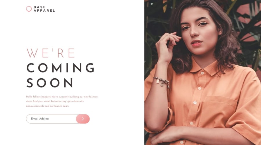
Responsive landing page using CSS Flexbox
Design comparison
Solution retrospective
Hey everyone,
This my solution to Base Apparel Coming Soon Page using HTML, CSS & JavaScript.
The only issue I had doing the project is placing the bg-pattern-desktop.svg on desktop.
All feedback is welcome and greatly appreciated.
Thanks,
Rebecca
Community feedback
- @JeuriMorelPosted over 1 year ago
I've got a few suggestions for changes to your CSS that should fix some of the
imgissues, like the stretching that occurs when resizing window and should keep theimgratio intact.I would replace all the style declarations on
.showcase imgwith a simpleheight: 100%;and change themax-width: 100%;on theimg, picture, svgselector withwidth: 100%;. A side effect of this is that the logo image will end up being too large at certain sizes, so select it and give it awidth: auto;In the media query for
.containerI would add a few declarations so it ends up looking like this:@media (min-width: 75em) .container { flex-direction: row; height: 100vh; overflow: hidden; align-items: center; }I would then remove the media query for the
.showcase img.This isn't necessary, but I would change the breakpoint for all current media queries from
75emto something like50embecause as it currently is you're using the mobile image at relatively large screen sizes with makes it really blurry.Adding the following query will line up the top of the image with the top of the page to keep the face properly in view.
@media (min-width: 75em)
picture.showcase {
    align-self: flex-start;
}
You can play around with the breakpoint numbers to something that looks good to you.
Marked as helpful2
Please log in to post a comment
Log in with GitHubJoin our Discord community
Join thousands of Frontend Mentor community members taking the challenges, sharing resources, helping each other, and chatting about all things front-end!
Join our Discord
