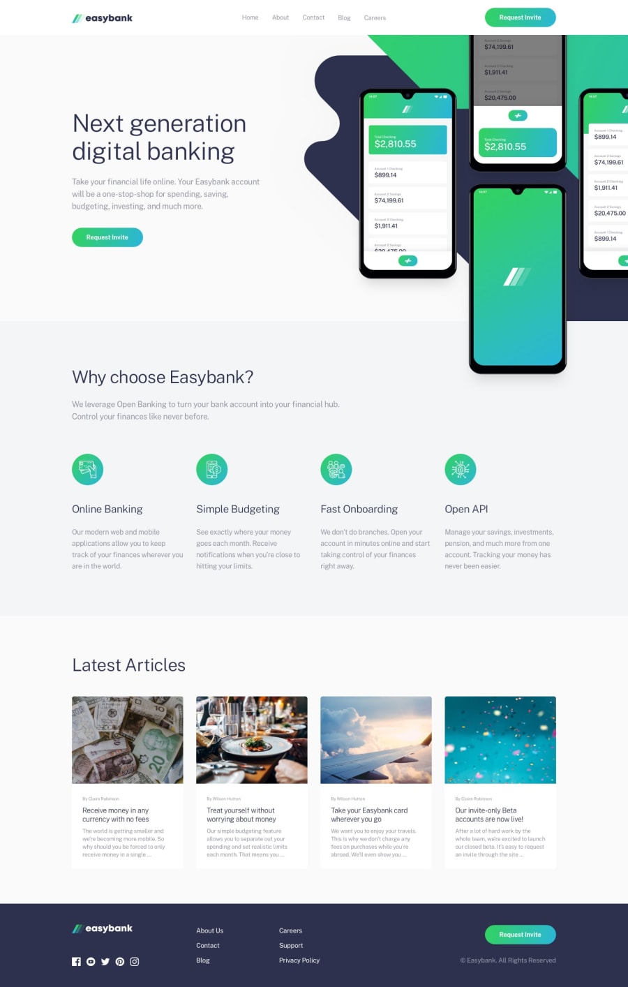
Design comparison
SolutionDesign
Community feedback
- @Mennatallah-HishamPosted about 1 year ago
Hi Cephas,
Great work
I have some suggestions to improve your code- each page should have only one <h1>
- it's not a good practice to use headings for logos , there is no need to wrap the logo in <h1>
<h1> <img src=""> </h1>- for logo img alt it is better to use alt="easy bank"
- it's better to use href="#" than using empty href
- you missed some <a> in nav bar and footer
<ul id="nav-bar"> <li> <a href="#home">Home</a></li> <li><a href="#about">About</a></li> <li><a href="#contact">Contact</a></li> <li><a href="#blog">Blog</a></li> <li><a href="#careers">Careers</a></li> </ul>- you can add meta description for better SEO
hope you find this helpful, Happy Coding
Marked as helpful0
Please log in to post a comment
Log in with GitHubJoin our Discord community
Join thousands of Frontend Mentor community members taking the challenges, sharing resources, helping each other, and chatting about all things front-end!
Join our Discord
