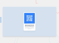
Design comparison
Solution retrospective
How we adjust the content at the center of the window. I do this using margin. Is there any other way to do this ? Also want to know more about use of media query.
Community feedback
- @IshmaelsealeyPosted over 1 year ago
Hi There!
Well done on completing your first challenge! 💯
To answer your question about centering the content: Yes, there are many ways of centering your content. Although you are already doing part of what is necessary to center your content!
Your
bodyis a flexbox and has thejustify-content: center;andalign-items: center;properties, however your body does not span the width and height of the user's screen. Use themin-width: 100vw;andmin-height: 100vh;on your body tag to make it appear centered.Media Queries are used to change the styling of specific elements on a webpage when the size of the screen changes. Styles can be nested in a media query, meaning that you do not need to write a new media query before each element you style.
@media screen and (min-width: 700px) {
body { ...styles... }
h1 { ...styles... }
}
Designing a mobile first website means that all your styles will be made for a mobile device initially Then you will use media queries so the styles change when the screen gets bigger than a specified size.
Finally, for the purpose of accessibility, your websites should contain one
<h1>tag. I saw you used a<h3>for your header.I hope my comment helps you! Happy Coding! 🪁
0
Please log in to post a comment
Log in with GitHubJoin our Discord community
Join thousands of Frontend Mentor community members taking the challenges, sharing resources, helping each other, and chatting about all things front-end!
Join our Discord

