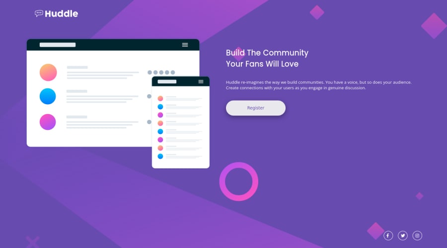
Design comparison
Solution retrospective
I am still learning about media queries, so any advice on that would be so welcome. Other problem I had was that some components would lay over others, I don't know why...
Community feedback
- @buneeIsSloPosted over 2 years ago
Hey! @alicialaborda, Congratulations on completing your first challenge here. You've put some solid effort into this one!
To solve your issues, I recommend you take the "Conquering responsive layouts" course(free) by Kevin Powell. I learned a lot about responsive layouts by going through this course and I'm sure you will too. However, if you don't have the time to go through it, this video by him should help too.
Hope this helps :)
1 - @AbsorberendPosted over 2 years ago
Hey!
A tip: you should look up "mobile first design" ( https://medium.com/@Vincentxia77/what-is-mobile-first-design-why-its-important-how-to-make-it-7d3cf2e29d00 ) . I noticed that the media query is for mobile (smaller resolutions) and the "normal css" is for the pc version. It's easier if you start mobile first and work your way up the resolutions.
I added a max-width of 350px to the .hero .text-section class for the big resolution. This makes it so that the text doesn't spread out all over the screen (on widescreen like I have). I also added the following media query to make the design more "fluent".
@media screen and (max-width: 900px) {

    .mockup{
      width: 500px;
    }

  }
Als to the mobile version I added the following code to the .hero class:
min-height: 600px;and to the .header class:
min-height: 50px;By giving a min-height to these classes you make it so they can't shrink below certain px, which means no overlap!
Hope this helps!
0
Please log in to post a comment
Log in with GitHubJoin our Discord community
Join thousands of Frontend Mentor community members taking the challenges, sharing resources, helping each other, and chatting about all things front-end!
Join our Discord
