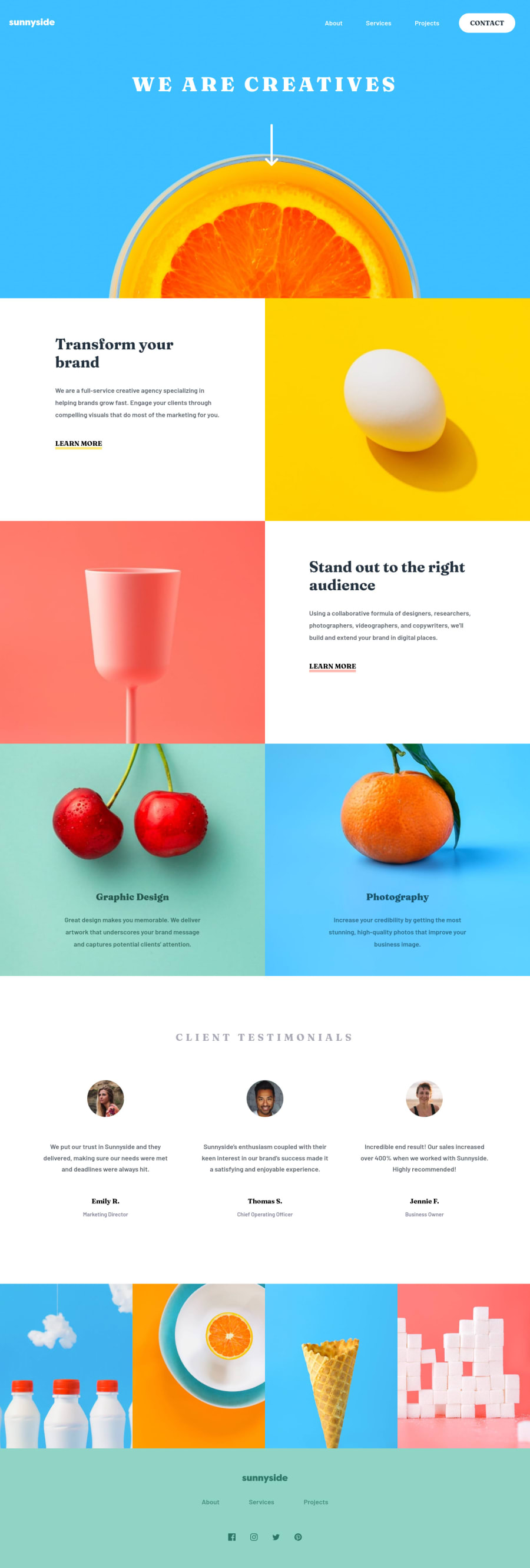
Design comparison
Solution retrospective
How can I better position the down-arrow? Let me know if you find any fault or something that can help me improve.
Community feedback
- @Art-wdtPosted over 3 years ago
Maybe it doesn't matter.
-
About this - check your report https://www.frontendmentor.io/solutions/responsive-landing-page-using-css-flexbox-f7wwnBubd/report
-
Please see design files in your challenge. I think .testimonials{background-color: rgb(255, 251, 248);} for example
0@DeCaptainDanPosted over 3 years ago@DeCaptainDan I just checked and didn't find it
0 -
- @Art-wdtPosted over 3 years ago
Hi @DeCaptainDan ! I completed this challenge just now. I liked your work. Great job
What about:
- HTML5 Landmark Elements
- Background color of the section with reviews
- <ul> must directly contain only <li>
- Burger menu doesn't work
Wish you happy coding!
0@DeCaptainDanPosted over 3 years ago@Art-wdt I haven't completed it yet... I will add that soon
1.What about the HTML5 landmark? 🤔 2. Isn't it white? 3. I will adjust that 4. I will add it soon
Thanks for your comment
1
Please log in to post a comment
Log in with GitHubJoin our Discord community
Join thousands of Frontend Mentor community members taking the challenges, sharing resources, helping each other, and chatting about all things front-end!
Join our Discord
