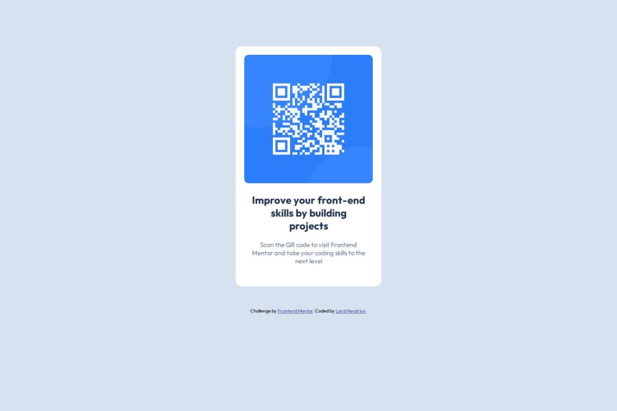
Design comparison
SolutionDesign
Solution retrospective
What are you most proud of, and what would you do differently next time?
I love how i paid attention to structuring my html document to allow ease in implementing CSS Flex-box.
What challenges did you encounter, and how did you overcome them?Initially, CSS Flexbox was a hassle to implement but i overcame it by applying core fundamental CSS principles as well as good html structure for easy flow.
What specific areas of your project would you like help with?I would like help with
- Feedback on how close i am to the design.
- how concise and readable my code is.
- how structured my html is also. And lastly, alternatives to solve the challenge.
Community feedback
- @huyphan2210Posted 16 days ago
Hi, @BeeAlmighty
I checked out your solution and I have some thoughts:
- Frontend Mentor will assess your solution once submitted. It's best to review your work and address any potential issues before submitting.
- Your
body
doesn't fill the entire viewport. The viewport refers to the visible area of the browser window. To ensure it fills the whole screen, you should applymin-height: 100vh
to thebody
. This is generally considered a best practice for most pages, though there are exceptions. Also, setmargin: 0
on thebody
, make it non-scrollable on desktops, as the browser adds default margins. - Since you're using Flexbox on the
body
, you can easily center the.container
(the card) by applyingmargin: auto
. This will center the card within the available space, and Flexbox will handle the rest for you. - For better accessibility and readability, try to use more semantic HTML elements instead of relying on
div
s. Elements likemain
,footer
, andarticle
provide meaning to the structure of the page and are better for SEO and screen readers. - You're using
h2
for the card title, but there's noh1
on the page. It's better to useh1
for the main heading, as it provides a clear hierarchy for both users and search engines. You can still style it to match the design using CSS. - Make your CSS class names more meaningful and descriptive. Research CSS naming conventions like BEM (Block Element Modifier), which can make your code easier to understand and maintain.
- Lastly, I'd recommend familiarizing yourself with the mobile-first approach. It’s a popular and effective method for building responsive designs, where you start styling for mobile screens and progressively enhance the design for larger screens.
Hope this helps!
0
Please log in to post a comment
Log in with GitHubJoin our Discord community
Join thousands of Frontend Mentor community members taking the challenges, sharing resources, helping each other, and chatting about all things front-end!
Join our Discord