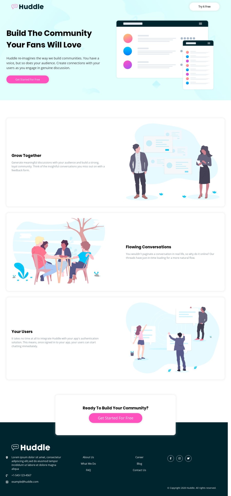
Responsive landing page using CSS Flexbox and Sass.
Design comparison
Solution retrospective
Hello everyone, I would like to hear any advice or suggestions to improve my code and media query as well. Thank you in advance.
Community feedback
- @akshaymagraniPosted over 4 years ago
@NoorAlhijab, Hello, Nice Coding! It matches quite well. Did you notice the list in your footer section though? It needs to be left-aligned instead of the center.
Indentation and a slight gap between each section is good practice, which I see you have incorporated here in your code (I looked over your GitHub HTML code). Might I suggest you also incorporate comments to highlight each section? As well as in your CSS files where feasible.
As for media query, where you used max-width, I generally go with min-width to add breakpoints. I don't see any reason why there should be only one correct way. Practice and find out which works for you.
There are resources available for free - (https://www.frontendmentor.io/resources). Go over them, you are sure to find something to teach yourself. I know I do.
1
Please log in to post a comment
Log in with GitHubJoin our Discord community
Join thousands of Frontend Mentor community members taking the challenges, sharing resources, helping each other, and chatting about all things front-end!
Join our Discord