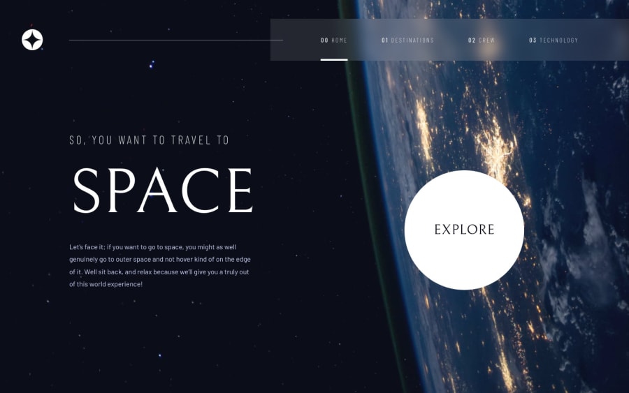
Responsive landing page using CSS Flexbox and positioning.
Design comparison
Solution retrospective
-
How to implement the Frosted Glass effect on navigation that works on all browser reliably?
-
What are the breakpoints chosen for font and UI scaling? Should I be using viewport width for scaling the fonts?
-
Is a JS-heavy approach much easier to control than only CSS approach for many of the dynamic elements on the website? For example, toggling the sidebar, or implementing a carousel.
-
I have not implemented a carousel. But it was not clear from the figma sketch itself. Is that something we had to implement? Or is there any other way to make it obvious to user that they need to tap/click on the navigation dots?
Community feedback
- @denieldenPosted almost 3 years ago
Hi Tanmaya, you did a great job!
For the Frosted Glass effect on navigation you can use css
backdrop-filterproperty, but remember: firefox does not support it and you can add an exception in firefox by putting a solid color there only through@supportsLook here:Also add
maintag and wrap the content for AccessibilityOverall you did well :)
Hope this help and happy coding!
0@arkni8Posted almost 3 years ago@denielden I am aware of backdrop-filter, but I chose not to use it precisely because it's been broken on firefox for over two months now. I have an alternate method implemented in the website which works very well if the user just uses the site normally haha.
Also thanks for the heads up about that accessibility issue. As I understand, the issue is just telling me to use semantically correct HTML.
But thanks for the feedback! Greatly appreciated!
1
Please log in to post a comment
Log in with GitHubJoin our Discord community
Join thousands of Frontend Mentor community members taking the challenges, sharing resources, helping each other, and chatting about all things front-end!
Join our Discord
