Submitted almost 3 years ago
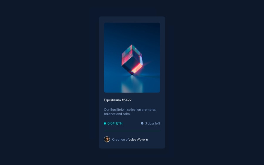
Responsive landing page using css flexbox and media queries
@S-chinGurjar
Design comparison
SolutionDesign
Community feedback
- @med-ghazaPosted almost 3 years ago
Hi, your project needs some editing I'll show you.
.main{ width: 350px; height: 596px; position: absolute; top: 50%; left: 50%; transform: translate(-50%, -50%); box-shadow: 0px 25px 50px rgba(0, 0, 0, 0.0952917); border-radius: 15px; } .img-container{ cursor: pointer }- For more info, You can check this out
Marked as helpful1 - @Aadv1kPosted almost 3 years ago
Hey! Here are some fixes I would suggest you apply on your project.
- Centering; To perfectly center your container over the body you can use positon absolute, like so -
.container { position: absolute; top: 50%; left: 50%; transform: translate(-50%, -50%) } - Semantic html; Semtantic html makes your code easier to read for both you,
and someone looking at your code. semantic html is basically.
<article>
 <h2> Title </h2>
 <p> Blah blah </p>
 </article>
is better and more redable than just putting everything inside a div. For more info You can check this out or you can check some of my projects out to see it in practice.
Marked as helpful1 - Centering; To perfectly center your container over the body you can use positon absolute, like so -
Please log in to post a comment
Log in with GitHubJoin our Discord community
Join thousands of Frontend Mentor community members taking the challenges, sharing resources, helping each other, and chatting about all things front-end!
Join our Discord

