Submitted almost 3 years ago
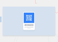
Responsive landing page using css flexbox and media queries
@S-chinGurjar
Design comparison
SolutionDesign
Community feedback
- @RioCantrePosted almost 3 years ago
Hello there! Good job with this challenge. Looking at your solution, I would suggest the following for you.
- Inside the
mainremove the height and add margin like this...
main { background-color: white; width: 30%; display: flex; flex-direction: column; align-items: center; justify-content: space-between; border-radius: 10px; box-shadow: 5px 10px 10px 5px hsl(212, 45%, 89%); margin: auto; margin-top: 10rem; }- Add
padding: 1rem;in the.heading h1rule set - Try removing the media queries and see if it still align in the center
- It's bad practice to use
sectionon every part of the HTML structure,sectionneeds heading hierarchy, you could try like this...
<main> <div class=" main-item qrcodeimg"> <img src="./image-qr-code.png" alt="qrcode.jpg"> </div> <section class="main-item heading"> <h1>Improve your front-end skills by building projects</h1> <p>Scan the QR code to visit Frontend Mentor and take your coding skills to the next level</p> </section> </main>- Remove the tags that aren't utilized like the
headerandnav
Hope this helps and Keep up the good work!
Marked as helpful1@S-chinGurjarPosted almost 3 years ago@RioCantre Thank you so much for the feedback. I'm just starting out with web dev . So it's really helpful to get such feedbacks . Once again thanks a lot. It was really helpful.
1 - Inside the
Please log in to post a comment
Log in with GitHubJoin our Discord community
Join thousands of Frontend Mentor community members taking the challenges, sharing resources, helping each other, and chatting about all things front-end!
Join our Discord

