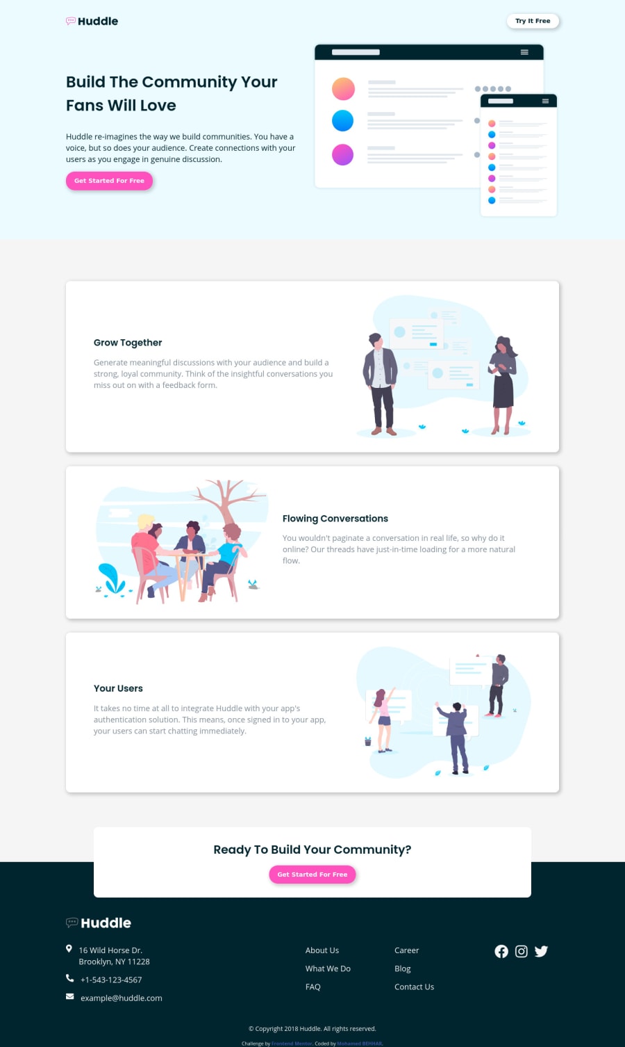
Responsive landing page using CSS flexbox and grid
Design comparison
Solution retrospective
Hy again, Hope you all having a good day :D here's my solution for this project, I really didn't like the footer on the original design so I made some changes to make it more beautiful, I also use "white smoke" for the body background instead of using white. My question: Should I use @media queries on the bottom for all elements, or should I use several @media for each one, which way it's more professional?
Community feedback
- @karenefereyanPosted over 3 years ago
Hey soqk, lovely work here. On mobile devices, the header could use a little more spacing to distinguish it from the nav. I'd say the same for the cards and footer too. Adequate spacing enhances legibility. Great work. Keep coding. Cheers!!! 😉😉😉😉
0@MohamedBehharPosted over 3 years ago@karenefereyan thank you a lot for your comment, your right, I have to pay more attention to the spacing on my designs.
0 - @pikapikamartPosted over 3 years ago
Hey, great work on this one. Though the desktop layout is somewhat smaller than the original but the mobile state on the other is fine.
Some suggestions would be that:
-
You shouldn't be nesting
atags insidebutton, you could just remove thatbuttonand make theatag look like a button and it is way more natural and suited for links. So changing all of thebuttonon your layout intoatags only will be a lot more better. -
Your huddle logo needs to have more descriptive and meaningful alt text and not just "logo". Also on the other images, if can be, then create more good alt text^
-
Also, on your
headertag, the background-image is not rendering properly. You usedbackground: url(/images/bg-hero-desktop.svg) no-repeat;which doesn't really work on github. Instead, you should usebackground: url(../images/bg-hero-desktop.svg) no-repeat;, I added../this means go up by one level. -
Your footer social media icons should be wrapped inside
atags, since they are links right, so they need to be wrapped around.
Still, good job on this ^
0@MohamedBehharPosted over 3 years ago@pikamart oh my god this is really helpful, thanks a lot. I will rectify my code, and thank you again.
0 -
- P@palgrammingPosted over 3 years ago
⭐⭐⭐⭐⭐ Looks great and nice how you changed the color of the huddle logo in the footer with the CSS filtering
0@MohamedBehharPosted over 3 years ago@palgramming first of all I want to thank you for taking your time and reviewing all my challenges. To be honest, I struggled to do that, but after some research, I found the solution on StackOverflow and it works.
0
Please log in to post a comment
Log in with GitHubJoin our Discord community
Join thousands of Frontend Mentor community members taking the challenges, sharing resources, helping each other, and chatting about all things front-end!
Join our Discord
