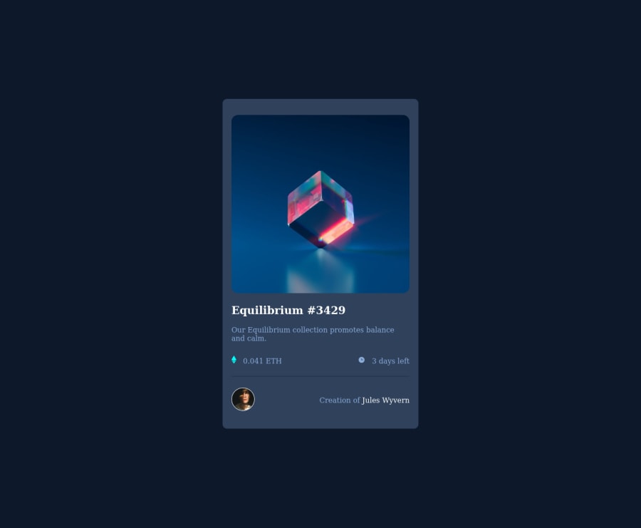
Design comparison
Solution retrospective
Feedback is welcome
Community feedback
- @tchydyPosted over 2 years ago
Hello Ahmad, Welldone on completing this project. As per feedback you may want to set width and height to your body, main and content. For instance style the body like this, body{width: 100%; height: 100vh; background-color: #0d192b; position: relative; font-family: 'Outfit', sans-serif} add the font family 'outfit' to the body's css styiling, as well as in the head of your HTML code.
Set main to the center of the body and give it specific width and height also don't forget to use the specified colors provided in the style guide. Here I used the hex values. main{position: absolute; top: 50%; left: 50%; transform: translate(-50%, -50%); width: 350px; height: 600px; background-color: #14253d} With these changes it should look better. Keep up the good work!
Marked as helpful0@folaa01Posted over 2 years agoHi Tochi, Thanks so much for the feedback. Will make corrections to it
1
Please log in to post a comment
Log in with GitHubJoin our Discord community
Join thousands of Frontend Mentor community members taking the challenges, sharing resources, helping each other, and chatting about all things front-end!
Join our Discord
