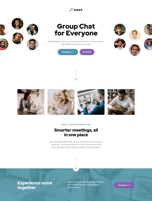
Responsive landing page using CSS Flexbox

Solution retrospective
I'm proud of having organized myself well before starting to write any lines of code. In Figma itself, I've already separated the sections for each screen size and planned out how the classes would adapt, especially for desktop. I've also been pleased with how I'm adapting to Sass and its folder structure to keep projects more organized. Finally, I'm happy with the end result, which stayed very true to the design.
What challenges did you encounter, and how did you overcome them?The biggest challenge was with the hero images, which behave differently as we open the screen size. Creating a logic to structure this in a way that would be easy to code for all sizes was the icing on the cake.
Please log in to post a comment
Log in with GitHubCommunity feedback
No feedback yet. Be the first to give feedback on Diogo Luxa's solution.
Join our Discord community
Join thousands of Frontend Mentor community members taking the challenges, sharing resources, helping each other, and chatting about all things front-end!
Join our Discord