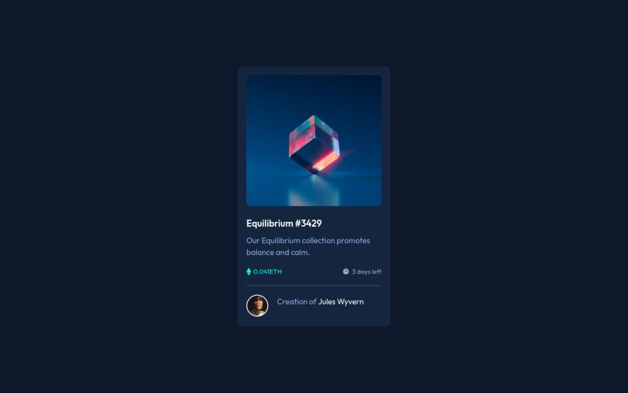
Design comparison
SolutionDesign
Solution retrospective
This is my first project, any feedback would be appreciated...
Community feedback
- @elroytoscanoPosted almost 3 years ago
You've used a
h3as yourcard-titlecomponent. Change it to anh1as there needs to be one level-one heading.In addition, while hovering over the image, use
cursor:pointerto provide visual feedback to the user.Other than this, you've done a good job at the design.
Marked as helpful1@AbdullayevaAyselPosted almost 3 years ago@elroytoscano Thank you very much. I will take into account what you have said
0
Please log in to post a comment
Log in with GitHubJoin our Discord community
Join thousands of Frontend Mentor community members taking the challenges, sharing resources, helping each other, and chatting about all things front-end!
Join our Discord
