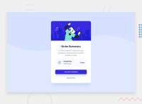
Design comparison
Solution retrospective
I am proud of this project, because it is my first one.
What challenges did you encounter, and how did you overcome them?The most difficult thing was to adjust the website to make it responsive on smaller screens. I just kept trying until I succeeded.
What specific areas of your project would you like help with?I want to know what I still need to work on. Where is the biggest problem in my code.
Community feedback
- @AdrianoEscarabotePosted 20 days ago
Hi nataliab94, how are you doing? I really loved the outcome of your project, but I have a few suggestions that I think might be helpful:
To prevent the background image from breaking at higher resolutions, we can prevent this in two different ways:
-
Add a
background-repeat: repeat-x;, the image will repeat on the horizontal axis, preventing it from breaking. -
Add a
background-size: 100% 50vmin;, the50vminwill set its height as the page target, and 100% will make it stretch on the horizontal axis.
Feel free to choose one of the two!
The rest is excellent.
I hope you find it useful. 👍
Marked as helpful0@nataliab94Posted 15 days ago@AdrianoEscarabote Hi Adriano! Thanks, I'm fine. Thanks a lot for your help. I'm going to improve my code with your indications :)
1 -
- @asimsaeed353Posted 20 days ago
Congratulations on your first design. To make the design responsive, avoid having fixed heights and widths of the elements. You can use '%' to set width of the element, so the element's size will increase or decrease depending upon the screen size. Keep your design game up! :)
Marked as helpful0@nataliab94Posted 15 days ago@asimsaeed353 Thanks, I will remember about it for my next projects.
1
Please log in to post a comment
Log in with GitHubJoin our Discord community
Join thousands of Frontend Mentor community members taking the challenges, sharing resources, helping each other, and chatting about all things front-end!
Join our Discord

