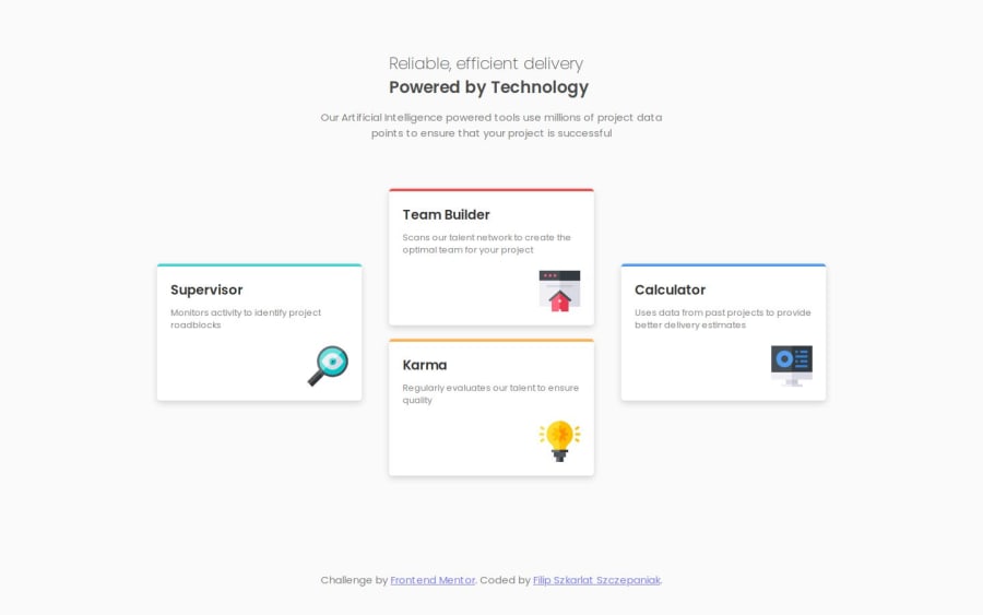


Design comparison

Solution retrospective
I feel quite confident with the code I wrote, but I suspect that I could have written something better or in a different way, if you find something like that, please comment :)
Community feedback
- @XenoMeePosted about 1 year ago
Hello Filip! Your solution looks great and like the design. Great job 👏
I might have a few suggestions for you to improve it:
- You can set a 100svh size for the body's
min-heightproperty instead ofmain. - Try to avoid using id selectors for styling as it raises specificity. Use classes as much as you can, even if you use them one time. This makes everything stay at the same level.
- It's not ideal to set a width on texts (your h1 and p) since it affects the responsiveness of the website.
- I personally would use a container for all your content inside main, then one more for the intro text and one more for all the cards. This makes your website be more component based and structured.
- For the images inside each card, you can use the
::afterpseudo-element since their purpose is to be decorative and does not present any context or meaning for the people who use screen readers. - You can use
gridfor the desktop layout since grid is often used for layout purposes whileflexboxis used more for individual components.
Hope this information helped you 😊
Happy coding!
Marked as helpful0@FilipSzkarlatPosted about 1 year agoHello Adrian!
Thanks for the comment, I learned a lot of new things 😊. Could you explain a little more how I can use ::after in my case?
1@XenoMeePosted about 1 year agoGladly!
So, when you select each individual card with your id selectors, for example:
#supervisor { border-top: 4px solid hsl(180, 62%, 55%); }
You can use the
::afterpseudo-element like this:#supervisor::after{ content=""; display: block; background-image:url("/images/supervisor.svg") width: (the svg's width) height: (the svg's height) }Marked as helpful0@FilipSzkarlatPosted about 1 year agoGreat!
Thanks a lot, I followed your advices and improved the code, apart from using grid for the layout, I will use this advice in my next projects ;)
1 - You can set a 100svh size for the body's

Please log in to post a comment
Log in with GitHub
Join our Discord community
Join thousands of Frontend Mentor community members taking the challenges, sharing resources, helping each other, and chatting about all things front-end!
Join our Discord