Design comparison
Community feedback
- @R3ygoskiPosted 7 months ago
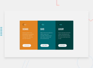
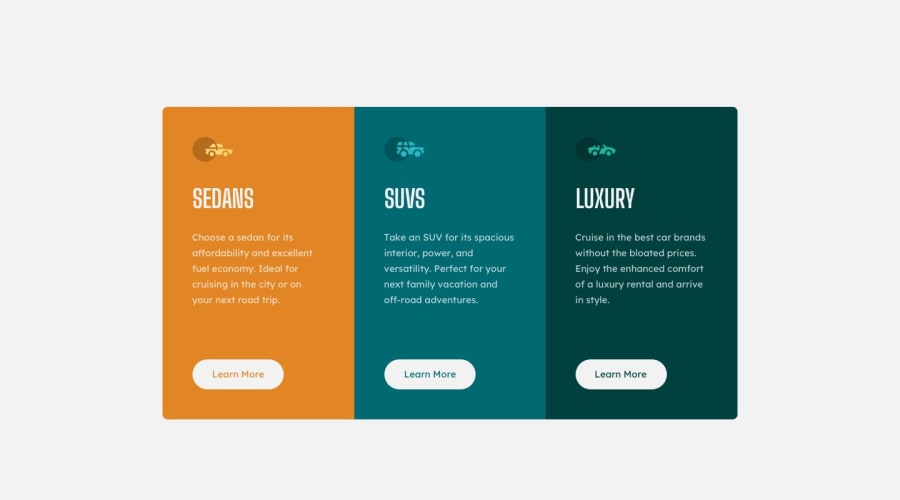
Hello @devEduSousa, your project is very well done, congratulations! It almost resembles the proposed design.
I'd like to offer some tips that might help you get even closer to the proposed design. One suggestion is to use a browser extension called PerfectPixel.
I also noticed that in each card, the buttons become misaligned on screens larger than 1100px. This happens because the text inside them shrinks, causing the buttons to move up and become misaligned. To fix this, you can use the
display: flex;property on the cards and then applyflex-direction: column;. This will make the content stack vertically instead of horizontally. Finally, usejustify-content: space-betweenandalign-items: flex-startto spread the content evenly and align it to the left of the card.Once again, congratulations! Keep practicing and improving. If you have any questions about what I said, please ask below, and I'll do my best to help.
Marked as helpful0
Please log in to post a comment
Log in with GitHubJoin our Discord community
Join thousands of Frontend Mentor community members taking the challenges, sharing resources, helping each other, and chatting about all things front-end!
Join our Discord
