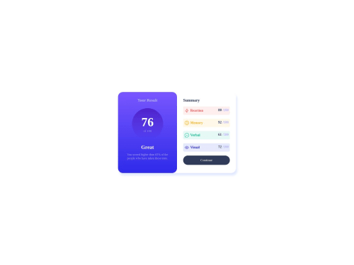
Not Found
Not Found
Not Found
Not Found
Not Found
Not Found
Not Found
Not Found
Not Found
Not Found
Not Found
Not Found
Not Found
Not Found
Not Found
Not Found
Not Found
Not Found
Not Found
Not Found

Submitted

Responsive landing page using CSS flex

Davidβ€’ 40

@David23-Dev

Desktop design screenshot for the Results summary component coding challenge

This is a solution for...

  • HTML
  • CSS
1newbie
View challenge

Design comparison


SolutionDesign

Solution retrospective


My English is bad sorry, this is my first challenge and I just started learning html and css

Community feedback

Tushar Biswasβ€’ 4,080

@itush

Posted

Congratulations on completing the challenge! πŸŽ‰

Welcome to the platform! πŸŽ‰ We're thrilled to have you here and excited to see your progress πŸ’ͺas you continue your front-end development journey.

Your solution looks nice to me :)

In my projects:

  • I always start with mobile-first workflow.
  • I use at least one main element for a page (entire content goes into the main, if I'm not using header & footer), and avoid divs as much as possible and use section and article element wherever I can.
<body>
<main>
All content 
</main>
</body>
  • I Use relative units as much as possible and avoid absolute units whenever possible.

  • If you are someone who is just starting out with front-end development, I strongly suggest starting with the QR code component project. Also in the challenges page you may filter by (Newbie, HTML&CSS) sort by (easier first) to select projects that will help you solidify your foundation. To avoid any potential knowledge gap⚠️ please first solidify HTML, CSS, JS fundamentals and then move on to any framework or library.

  • I remember when I started out, I made countless mistakes and spent long hours searching for solutions. But hey, you don't need to go through the same struggles! πŸ™Œ To help you shorten the learning curve, I recommend going through the following articles. They contain valuable insights that can make your journey smoother:

πŸ“šπŸ” 12 important CSS topics where I discuss about css position, z-index, box-model, flexbox, grid, media queries, mobile-first workflow, best practices etc. in a simple way.

πŸ“šπŸ” 11 important HTML topics where I discuss about my thought process and approach to convert a design/mock-up to HTML along with important topics like block and inline elements, HTML Semantic Elements.

I hope you find these resources helpful in your coding adventures! 🀞

I'm eagerly looking forward to seeing the amazing projects you'll create in the future! πŸš€πŸ’»

Keep up the fantastic work and happy hacking! πŸ’ͺ✨

Marked as helpful

1
Rohit Deshpandeβ€’ 870

@rohitd99

Posted

Hi David

Congrats on completing your first challenge πŸ₯³πŸŽ‰.

Also no need to apologise for your english. Now coming to the challenge I have some suggestions for you.

I see you've implemented the solution nicely for the mobile and desktop sizes but for tablet size they don't cover the entire width.

@media screen and (max-width: 600px)
{
body{
justify-content : start;
}
.contenedor {
box-shadow: none;
flex-direction: column;
height: auto;
/* width: auto; */
width: 100%;
justify-content: start;
/* align-items: center; */
}
#tusResultados {
border-top-left-radius: 0;
border-top-right-radius: 0;
width: auto;
}
#summarry {
width: auto;
}
}

I believe these properties should make it better on tablet sizes.

Other than that I also see you've used headings in a wrong way, h1 heading must only be used once per page. All the headings must be in order that is h1 then h2 and so on. Here's a video for correct usage of headings.

Overall you've done well for your first solution, used semantic elements. Keep going and you'll learn things in no time.

1

Please log in to post a comment

Log in with GitHub
Discord logo

Join our Discord community

Join thousands of Frontend Mentor community members taking the challenges, sharing resources, helping each other, and chatting about all things front-end!

Join our Discord