Submitted about 4 years ago
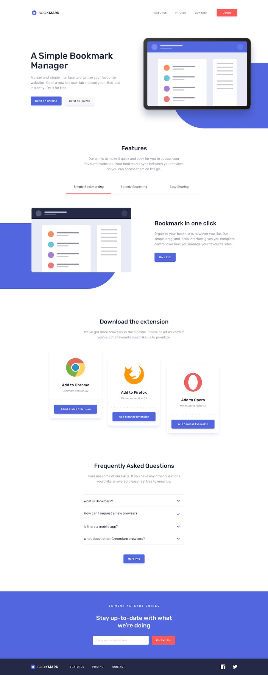
Responsive landing page using CSS flex property and CSS positioning
@Afolabi-bit
Design comparison
SolutionDesign
Solution retrospective
Please I need your feedback on the email validation. This is my first attempt at it.
Community feedback
- @ApplePieGiraffePosted about 4 years ago
Hey, Joseph Afolabi! 👋
Your solution looks good and responds nicely! I like the hover states of the buttons in your solution and your email validation works great! 🙌
I only suggest,
- Decreasing some of the space between each question and the answer of the FAQ accordion to bring the content closer together.
- The "More Info" buttons seem to be missing a hover state.
Keep coding (and happy coding, too)! 😁
0@Afolabi-bitPosted about 4 years agoThank you so dearly for your suggestions. I'm def keeping them✌️
0
Please log in to post a comment
Log in with GitHubJoin our Discord community
Join thousands of Frontend Mentor community members taking the challenges, sharing resources, helping each other, and chatting about all things front-end!
Join our Discord
