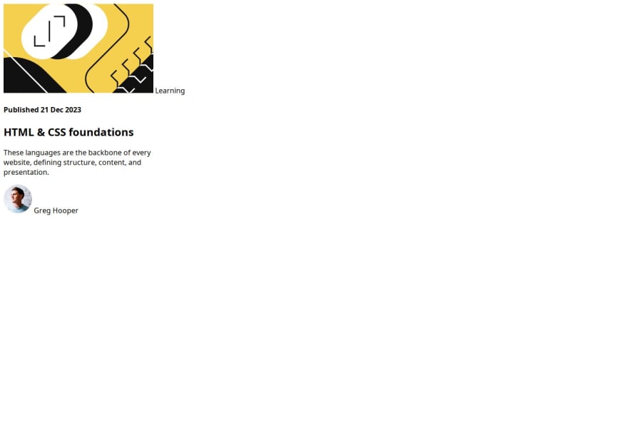
Design comparison
SolutionDesign
Solution retrospective
What are you most proud of, and what would you do differently next time?
i was proud of the improvement on my css styling compared to the previous projects
What challenges did you encounter, and how did you overcome them?the css part gave me a little bit of challenge, i had to get clue from chatgpt
What specific areas of your project would you like help with?css
Community feedback
- @PsalmorgPosted 14 days ago
- Try to put all your code in a container
- Use an heading element for the learning and style it display: inline; after that, you can give it a padding and the background color
- You can create a footer in the main for the blogger image and name. display: flex; will make them come inline and a little bit of margin will create a space.
- border-radius for the blog card image and the main that act as the container
- You can now create a box-shadow for the main to achieve the shadow effect Good but try to check others solution and go to discord and check similar project that have a feedback already. I was told told this morning not to feel shy. There, there are more better way than mine with great people doing things in simpler way with good semantics
0
Please log in to post a comment
Log in with GitHubJoin our Discord community
Join thousands of Frontend Mentor community members taking the challenges, sharing resources, helping each other, and chatting about all things front-end!
Join our Discord