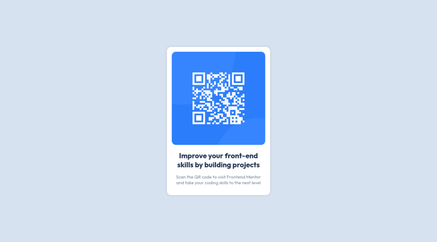
Responsive Landing page using css Flex Display
Design comparison
Solution retrospective
It difficult to align items vertically. Since I haven't set height for the body. I wasn't able to center it vertically. It's nice challenge.
Community feedback
- @MelvinAguilarPosted almost 2 years ago
Hello 👋. Congratulation on successfully completing your first challenge 🎉 ! !
I have other recommendations regarding your code that I believe will be of great interest to you.
- Wrap the page's whole main content in the
<main>tag.
-
The
altattribute should explain the purpose of the image. Uppon scanning the QR code, the user will be redirected to the frontendmentor.io website, so a betteraltattribute would beQR code to frontendmentor.ioIf you want to learn more about the
altattribute, you can read this article. 📘.
I hope you find it useful! 😄 Above all, the solution you submitted is great!
Happy coding!
1 - Wrap the page's whole main content in the
- @HassiaiPosted almost 2 years ago
Replace <div class="card"> with the main tag <main> and <h2> with <h1> to fix the accessibility issues. click here for more on web-accessibility and semantic html
Give h1 and p the same font-size of 15px which is 0.9375rem the same margin-left and margin-right values.
Use relative units like rem or em as unit for the padding, margin, width values and preferably rem for the font-size values, instead of using px which is an absolute unit. For more on CSS units Click here
Hope am helpful.
Well done for completing this challenge. HAPPY CODING
0
Please log in to post a comment
Log in with GitHubJoin our Discord community
Join thousands of Frontend Mentor community members taking the challenges, sharing resources, helping each other, and chatting about all things front-end!
Join our Discord
