
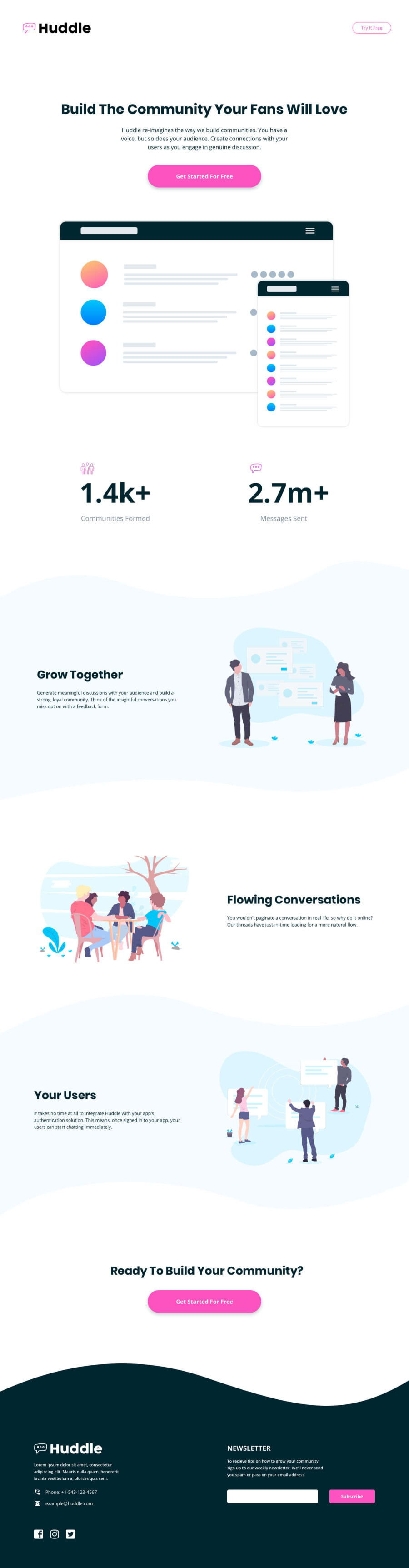
Responsive Landing page using css flex and semantic tags


Design comparison
Solution retrospective
Hey, folks, I have done this project with semantic tags and CSS flex.
I am open to any kind of feedback!
Community feedback
- @MelvinAguilarPosted 12 months ago
Hello there 👋. Good job on completing the challenge !
I have some suggestions about your code that might interest you.
- Consider adopting a Mobile First approach in your next project. This means designing for the smallest screens first and then scaling up as needed. This helps to create a more user-friendly and accessible experience for all users.
- Apply the
font-family: "Open Sans", sans-serif;globally to the body or a container element instead of individually on each text element. This enhances organization and reduces redundancy.
- The
<nav>tag may not be necessary in the header if there are no navigation links present.
- In the mobile view of sections 2, 3, and 4, the order seems mixed up. Images are followed by text and vice versa. As a curiosity, you can use
flex-direction: row-reverse;when usingdisplay: flexto reverse the order of elements.
- The alt attribute doesn't necessarily need underscores; it's perfectly acceptable to use spaces for better readability. Also, leaving the alt attribute empty is valid when an image is purely decorative, serving no additional content or meaning.
-
You should use the
aria-labelattribute to describe the links if they don't have visible text, this will help screen reader users to understand the purpose of the link. e.g.:<a aria-label="Facebook" class="facebook-icon" href="https://www.facebook.com/" target="_blank"><i ... ></i></a>
I hope you find it useful! 😄 Above all, the solution you submitted is great!
Happy coding!
Marked as helpful0@Priyanshu-WDPosted 11 months agoHey, @MelvinAguilar, thank you for checking out my code for this solution. I appreciate it. As you suggested, I used flex-direction: row-reverse for sections 2,3, and 4, but it did not work, I also used order property to make them happen, but it also did not work.
Can you please tell me, why they did not work with my code?
Thank you.
0

Please log in to post a comment
Log in with GitHub
Join our Discord community
Join thousands of Frontend Mentor community members taking the challenges, sharing resources, helping each other, and chatting about all things front-end!
Join our Discord