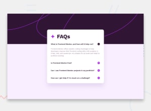
Design comparison
SolutionDesign
Solution retrospective
What are you most proud of, and what would you do differently next time?
I added an animation whenever the text panels appear, although I would prefer it to be different and smoother when the new div(s) is appearing (proper animation should look like it is gradually enlarging instead of it just suddenly being expanded)
What challenges did you encounter, and how did you overcome them?Accessing CSS properties from an in-line javascript block within the html file. I was kinda lost accessing the DOM
What specific areas of your project would you like help with?Improving the animation
Community feedback
- @XarlizardPosted 8 months ago
<h1>'s font size is not showing properly on this page pre-render, but it is working fine on the live site. ¯_(ツ)_/¯0
Please log in to post a comment
Log in with GitHubJoin our Discord community
Join thousands of Frontend Mentor community members taking the challenges, sharing resources, helping each other, and chatting about all things front-end!
Join our Discord
