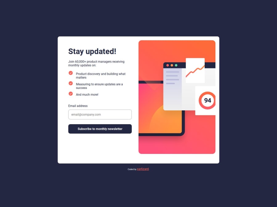
Design comparison
Solution retrospective
I like how that button hover color + shadow effect turned out 😎
What specific areas of your project would you like help with?Custom error like the one shown in desktop-design, where it shows a custom red error text above the input email field. Quite tricky to do it with plain html
Community feedback
- @jantomaPosted 12 months ago
hi, im relly amusement your code but I have some comment , you can use pattern directly in html <input type="email" id="email" name="email" pattern="[a-z0-9._%+-]+@[a-z0-9.-]+\.[a-z]{2,}$" required>
1@XarlizardPosted 12 months ago@jantoma hi,
Great, that's actually nice to hear! Thanks for the advice 😄
0
Please log in to post a comment
Log in with GitHubJoin our Discord community
Join thousands of Frontend Mentor community members taking the challenges, sharing resources, helping each other, and chatting about all things front-end!
Join our Discord
