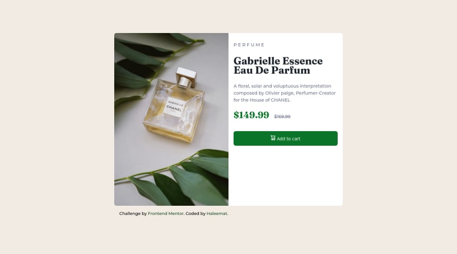
Responsive landing page using CSS flex and grid layout
Design comparison
Solution retrospective
It took me a great deal of time to complete this challenge as I met a roadblock of divs overlapping (don't know what cause that actually). I was able to maneuver my way out with help from friends.
I would like to ask what is the best practice for the styling of the card.
Community feedback
- @elaineleungPosted over 2 years ago
Hi Haleemat, well done completing your second challenge! I think you (and your friends) did a good job here; you basically got almost everything, and I really don't think there's a lot you need to change to make it better. I'd only change these few things:
-
Instead of using a percentage fixed width (e.g.,
width: 50%
) for your main container, try a max-width instead (you can also trywidth: min()
once you're more comfortable withmax-width
). The problem with using a percentage width is, things can look really odd on big screens and small screens. -
I see you using a star selector at the top of your CSS, which is a good start! I suggest using some CSS reset rules or a normalize style sheet to remove the browser's default styles first. One important reset/normalize rule I would add here is the one for images because you're using an image.
-
Lastly, great job using grid for centering everything! The only two things I'd change are the
place-items
property, which should beplace-content: center
, and I'd change the height tomin-height: 100vh
.
Altogether it looks like this:
* { margin: 0; padding: 0; box-sizing: border-box; } // image reset rule img, svg, picture { max-width: 100%; display: block; } // centering in body selector body { display: grid; min-height: 100vh; place-content: center; } // for desktop view .container { display: flex; flex-wrap: wrap; max-width: 600px; } // for mobile view @media screen and (max-width: 600px) { .container { max-width: 450px; margin: 2rem 1rem; // 1rem side margin added so that card sides won't touch browser flex-direction: column; } }
Hope this helps a bit, and keep practicing, you're doing great 🙂
Marked as helpful0@LittLotusPosted over 2 years ago@elaineleung thanks so much for the feedback. I'd make adjustment to the code base on your suggestions.💖
0 -
Please log in to post a comment
Log in with GitHubJoin our Discord community
Join thousands of Frontend Mentor community members taking the challenges, sharing resources, helping each other, and chatting about all things front-end!
Join our Discord