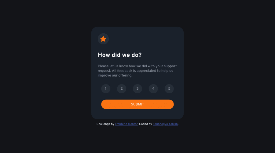
Responsive landing page using CSS Flex
Design comparison
Solution retrospective
Hi Viewers,
Please check my solution and point out some of my mistakes and areas I need to Improve. The issue I know is that I have used the same CSS properties in multiple classes. Please give me some suggestions on how to improve it, what I mean that how should I avoid writing the same CSS property again and again for different classes. For example, I have used this thing multiple times - { display: flex; justify-content: center; align-items: center; }
Community feedback
- @JoannaLapaPosted about 2 years ago
Hi SAUBHAGYA ASHISH!
Congratulations on finishing the project! It was my first project on frontendmentor, and I know already that making challenges helped me a lot in improving frontend skills. At this moment after a couple of months that I finished it I know that I should correct a few things ;).
Coming back to your project:
The main functionality works well and active states work well too. The desktop and tablet layout is pretty good. You used an input type radio with a label which I think is the best choice for this project.
What I recommend to improve:
At first, answering your question - to not repeat yourself you can create one common class for the same properties eg. flex { display: flex; justify-content: center; align-items: center; } And add this class to the tags in HTML where you want to use it - you can add several classes to the one tag, eg. <div class="container flex">, <div class="feedback-card-star flex"> . Another solution you can add the same properties like below: .container, .feedback-card-star, .votingReview { display: flex; align-items: center; justify-content: space-around; text-align: center; } And the code which is different you add separately like you already did in your project.
-
I think that you didn't prepare the mobile version layout for 375px width. The width of .feedback-card is bigger than 375px so automatically it is bigger than the mobile screen. To correct that you can change dimensions using media queries starting your styles from the mobile view (you can read about the mobile-first approach). You can also try clamp() functionmore about clamp here or try to work with max-width and min-height. For responsiveness, I highly recommend the video of Kevin Powell and his free course. And his whole youtube channel is full of helpful CSS stuff.
-
I noticed that you keep some styles code in the HTML file as. I recommend you to move everything to your index.css file as this is a good practice to separate HTML code and the CSS code.
-
Concerning js file - it is a good practice to use const and let instead of var (in most cases the best choice is const). Const and let are the features that came with ES6. You can read more about the difference between them 3 here.
I hope that my comment was helpful to you. Happy coding! Joanna
Marked as helpful1@saubhagyaashishPosted about 2 years agoHi @JoannaLapa Thank you so much for taking out your time and reviewing my code. It really means a lot. I will definitely work on these issues. Thanks again 😇.
1 -
Please log in to post a comment
Log in with GitHubJoin our Discord community
Join thousands of Frontend Mentor community members taking the challenges, sharing resources, helping each other, and chatting about all things front-end!
Join our Discord

