

Design comparison

Community feedback
- @alaa-mekibesPosted 3 months ago
Hi @Laloka2000 i see you have some issues with your code.
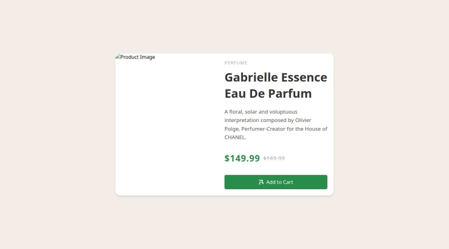
- Use
picturetag to add an image for desktop and how to change it for mobile like this :
<picture> <!-- Here Add all the images with small screen --> <source media="(max-width: 375px)" srcset="images/image-product-mobile.jpg" > <!-- Here Add the default image --> <img src="images/image-product-desktop.jpg" alt="Product image"> </picture>- Use css variables to improved maintainability, flexibility, and reduced redundancy within CSS code like this :
:root { --bg-color: hsl(210, 46%, 95%); /* Add your other colors here */ } body { background-color: var(--bg-color); /* Other properties */ }-
Add some
letter-spacingto the "PERFUME". And change thefont-family -
Improve the title size. And change the
font-familyalso. -
Change the
font-familyof the paragraph. -
Change the
font-familyof "$149.99" and make it bold.
h1, .price { font-family: "Fraunces", serif; font-weight: 700; } p, span , a { font-family: "Montserrat", serif; }-
idk why you use another svg icon on the button, you have icon on images folder you should use it.
-
This is my solution: Product preview card component
You're on the right track, @Laloka2000, keep up the awesome effort!
Marked as helpful0@Laloka2000Posted about 1 month agoHi @alaa-mekibes, thanks for your advice and suggestions! I checked my code and fixed it. I really appreciate your help.
0 - Use

Please log in to post a comment
Log in with GitHubJoin our Discord community
Join thousands of Frontend Mentor community members taking the challenges, sharing resources, helping each other, and chatting about all things front-end!
Join our Discord