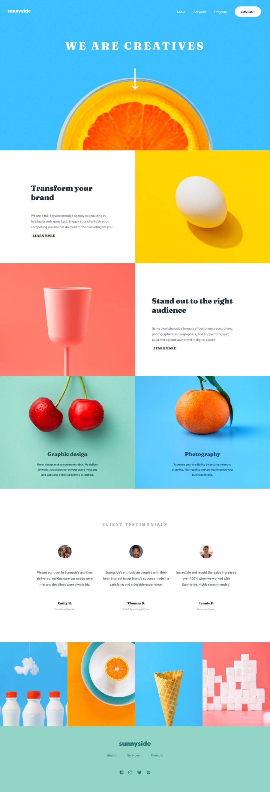
Design comparison
Solution retrospective
I still have some refactoring to do and fixes on the mobile menu, but any feedback appreciated
Community feedback
- @aUnicornDevPosted over 3 years ago
Hey,
The site perfectly matches on 1440px so kudos on that.
But if we move to a larger screens or smaller screens, the site isn't fully responsive because you have a breakpoint on 1024px and a
min-width:1440pxOn mobile view, use
background-position:centerwithbackground-image:url(...)because the images(hero, transform etc.) are pushed down1@Guin-Posted over 3 years ago@aUnicornDev thanks for the feedback! I might go back and try to make it more responsive across all sizes (there was no tablet design given for this one), but i was mostly focused on getting the code for desktop and mobile as close to thedesign as possible!
1@aUnicornDevPosted over 3 years ago@Guin- If that is the case, then WOHOOO!! You did great.🙌
0
Please log in to post a comment
Log in with GitHubJoin our Discord community
Join thousands of Frontend Mentor community members taking the challenges, sharing resources, helping each other, and chatting about all things front-end!
Join our Discord
