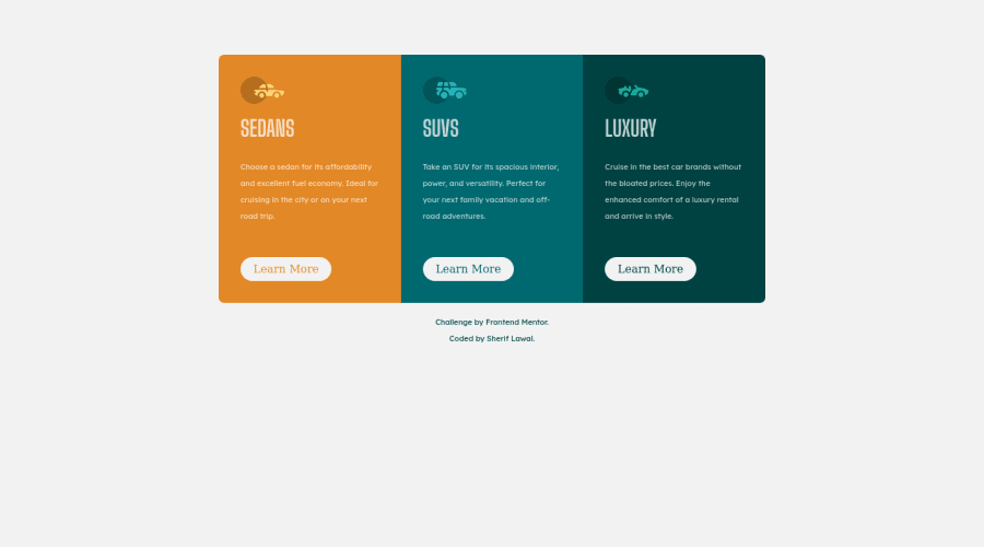
Responsive landing page using CSS
Design comparison
Solution retrospective
Grid & flex
Community feedback
- @VCaramesPosted about 2 years ago
Hey @lawal2000, some suggestions to improve you code:
-
The car images/icons serve no other purpose than to be decorative; They add no value. Their Alt Tag should left blank and have an aria-hidden=“true” to hides it from assistive technology.
-
For media queries, I definitely suggest using em for them. By using px your assuming that every users browser (mobile, tablet, laptop/desktop) is using a font size of 16px (this is the default size on browser). Em's will help with users whose default isn't 16px, which can sometimes cause the your content to overflow and negatively affect your layout.
More Info:
https://betterprogramming.pub/px-em-or-rem-examining-media-query-units-in-2021-e00cf37b91a9
Happy Coding! 👻🎃
Marked as helpful0@lawal-sherif-itunuPosted about 2 years ago@vcarames thanks so much, I have learnt somethings from that thanks
0 -
Please log in to post a comment
Log in with GitHubJoin our Discord community
Join thousands of Frontend Mentor community members taking the challenges, sharing resources, helping each other, and chatting about all things front-end!
Join our Discord
