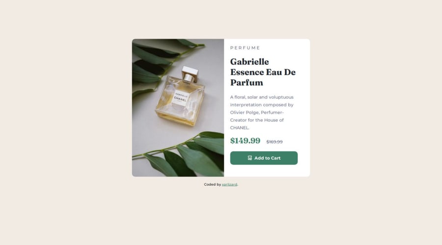
Design comparison
Solution retrospective
.
What challenges did you encounter, and how did you overcome them?.
What specific areas of your project would you like help with?It's not a smooth responsive experience, I would need help with that
Community feedback
- @DanCodeCraftPosted 9 months ago
It's looking good overall. To have a better transition between desktop x mobile, set your media queries for when the layout starts breaking. In this case, your design breaks around 550px wide, and then it takes a long time until you make it mobile-friendly. This means any user with weird screen sizes will have problems accessing your page.
Checking your CSS file, I see you didn't start with one nor another, you just straight up had a query. A piece of advice: write your HTML based on the desktop version, and start your CSS based on the mobile design first.
This will save you a ton of work and a nice headache down the road.
Keep up the good work!
Marked as helpful1@XarlizardPosted 9 months ago@DanCodeCraft thanks man, I was really struggling with how to adress media queries correctly as I've never used them before.
I've seen the project of another fellow member of this community here at his style.css page for this project and I was thinking about replicating the way he uses the media query at the bottom of the page, what do you think? Is it a good example to follow up?
0@DanCodeCraftPosted 9 months ago@Xarlizard seems like a good solution, yes. I made a simpler one, and it worked well too. I'm case you're interested: https://www.frontendmentor.io/solutions/product-preview-grid-solution-media-query-1i8ZZlR0EE
Marked as helpful1
Please log in to post a comment
Log in with GitHubJoin our Discord community
Join thousands of Frontend Mentor community members taking the challenges, sharing resources, helping each other, and chatting about all things front-end!
Join our Discord
