

Design comparison

Solution retrospective
I’m able use css grid
What challenges did you encounter, and how did you overcome them?Using the max-width is hard as fuck.
Community feedback
- @hubertasGeciauskasPosted 5 months ago
Hey, looks solid overall! Just a couple of things:
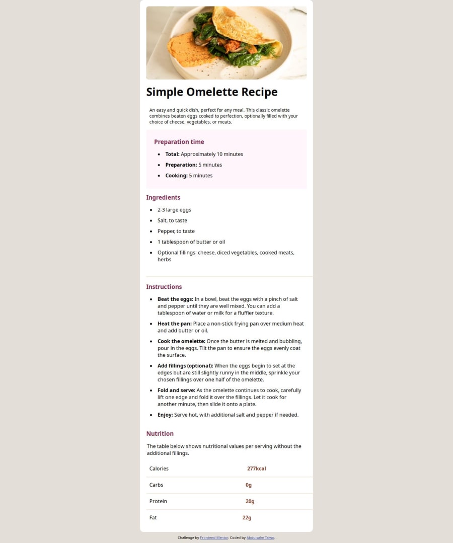
For the nutrition info, consider using a <table>. It'll make it way clearer and easier to follow. You’ve got a few <h1> tags—better to just use one and go with <h2> or <h3> for the subheadings. It keeps things tidy and accessible. On desktop, the horizontal dividers in the table are spilling out of the card. A little padding tweak should fix that. You're doing great, just these little fixes will make it even better! Keep it up!
Marked as helpful1@SymplyteeziyPosted 5 months ago@hubertasGeciauskas Thanks, I will ensure correct the error.
0

Please log in to post a comment
Log in with GitHubJoin our Discord community
Join thousands of Frontend Mentor community members taking the challenges, sharing resources, helping each other, and chatting about all things front-end!
Join our Discord