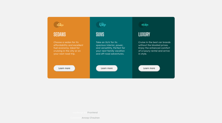
Design comparison
Solution retrospective
Feel free to check my work.
Community feedback
- @VCaramesPosted about 2 years ago
Hey @anoopkundu567, some suggestions to improve you code:
- To center you content to your page, add the following to your Body Element:
body { min-height: 100vh; display: grid; place-content: center ; }-
The car images/icons serve no other purpose than to be decorative; They add no value. Their Alt Tag should left blank and have an aria-hidden=“true” to hides it from assistive technology.
-
The headings are being use incorrectly. For this challenge, each heading is equally as important. So best option, is to use <h2> Heading, because it will give each card the same level of importance and it's reusable.
-
Your content is not fully responsive. Here is a link to Google Developer’s site that will teach you how make it 100% responsive:
Happy Coding! 👻🎃
Marked as helpful0@anoopkundu567Posted about 2 years ago@vcarames Thank you!! i will improve my skills.
0 - @correlucasPosted about 2 years ago
👾Hello Anoop, Congratulations on completing this challenge!
Great code and great solution! I’ve few suggestions for you that you can consider adding to your code:
To make your CSS code easier to work you can create a
single classto manage the content that is mostly the same for the 3 cards (paddings, colors, margins and etc) and another class to manage the characteristics that are different (colors and icon), this way you'll have more control over then and if you need to change something you modify only one class.✌️ I hope this helps you and happy coding!
0
Please log in to post a comment
Log in with GitHubJoin our Discord community
Join thousands of Frontend Mentor community members taking the challenges, sharing resources, helping each other, and chatting about all things front-end!
Join our Discord
