
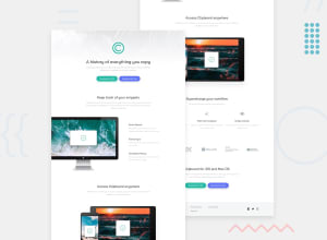
Responsive Landing Page using CSS

Design comparison

Solution retrospective
Hi there! Here is finally my solution to the clipboard landing page. This is my first time working on Responsive Design and Media Queries. Also i used Git for the first time. I would like to see your advices and suggestion to improve the solution, and Thanks in advance.
Community feedback
- @yefreescodingPosted over 1 year ago
👋Eyy...
Being your first time working with a responsive design, I have to say that you did a good job. I'd like to share some tips and advice for you to keep learning, and become a better front end developer.
Semantic HTML is the way to go:
- When coding the structure of your webpage try to use as more semantic html tags as posible. Using <div> containers for everything is considered a bad practice. <header>, <main>, <section>, <aside>, <quote>, <footer>, <article>, <picture>, etc.
- You can check this article Link here.
- This video will help you too Semantic HTML
Responsive layouts:
- The key to develop layouts that are responsive, is using the correct media queries, understand relative units, the advantages of Flexbox and Grid.
- This is a old article but will help you understand media queries link
- Check this video Responsive design No media queries
I hope this resources can help you. You're going for the right path, and I believe you could become a great front end developer.
1

Please log in to post a comment
Log in with GitHub
Join our Discord community
Join thousands of Frontend Mentor community members taking the challenges, sharing resources, helping each other, and chatting about all things front-end!
Join our Discord